Scatter Plot from Scientific Research

CC-BY
5
Views
0
Likes
Citation
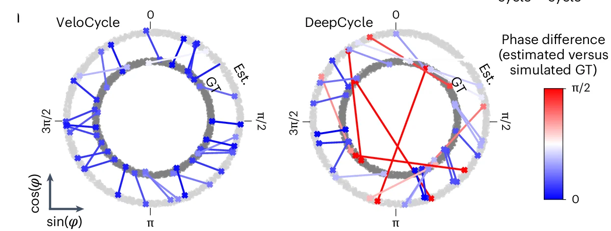
Polar plots representing the phase difference between estimated (Est.) and simulated GT for 30 randomly chosen cells from one simulated dataset using VeloCycle (left) and DeepCycle (right). Each dot represents a cell, and lines connect the estimated phase assignment (light gray) to simulated GT (dark gray).
#Scatter Plot#Line Plot#Polar Plot#Phase Difference#VeloCycle#DeepCycle#Cell#Phase Assignment#Simulation
Related Plots
Browse by Category
Popular Collections
Related Tags
Discover More Scientific Plots
Browse thousands of high-quality scientific visualizations from open-access research