Curated Collections
By plottie
Collection Links
- Multiple Panel Plot (377 plots)
- Flowchart (300 plots)
- Line Plot (175 plots)
- Bar Plot with Error Bars (166 plots)
- Scatter Plot (165 plots)
- Bar Plot (138 plots)
- Heatmap (134 plots)
- Box Plot (101 plots)
- Network (66 plots)
- Violin Plot (59 plots)
- UMAP Plot (59 plots)
- Line Plot with Error Bars (59 plots)
- Study Design (55 plots)
- Workflow Diagram (54 plots)
- Density Plot (46 plots)
- Volcano Plot (43 plots)
- Pathway Diagram (39 plots)
- Paired Dot Plot (34 plots)
- Hypothesis Illustration (31 plots)
- Bubble Plot (30 plots)
- Forest Plot (26 plots)
- Regression Plot (24 plots)
- Geo Map (21 plots)
- Ridge Plot (18 plots)
- Genome Coverage Profile (17 plots)
- Scatter Plot with Error Bars (17 plots)
- Raincloud Plot (16 plots)
- Survival Curve (16 plots)
- Histogram (16 plots)
- UpSet Plot (13 plots)
- Manhattan Plot (12 plots)
- Venn Diagram (12 plots)
- Chord Diagram (11 plots)
- ROC Curve (9 plots)
- Sankey Diagram (9 plots)
- PCA Plot (8 plots)
- Pie Chart (7 plots)
- Donut Chart (6 plots)
- Conclusion Diagram (4 plots)
- PR Curve (3 plots)
- Illustration (3 plots)
- QQ Plot (2 plots)
- Line Plot with Scatter (2 plots)
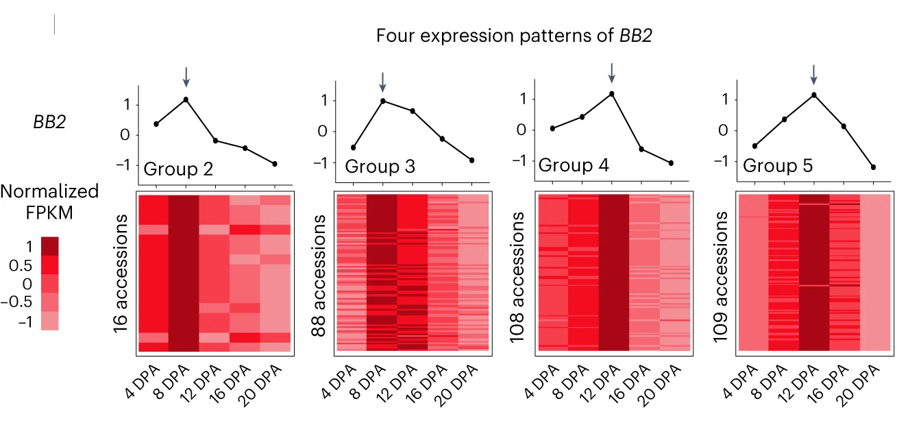
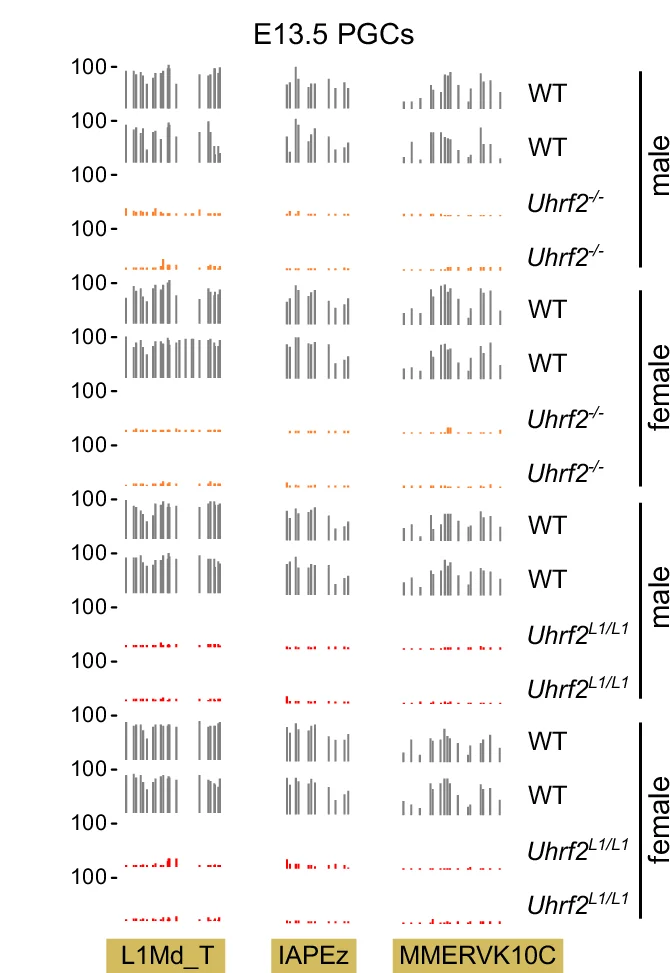
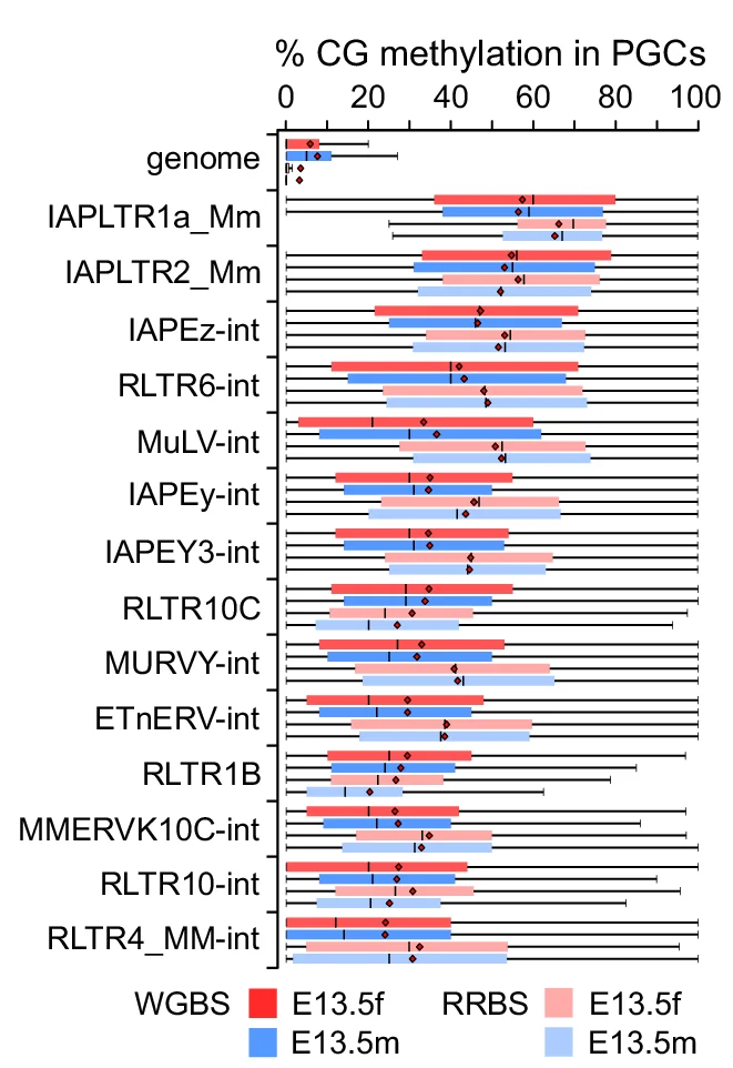
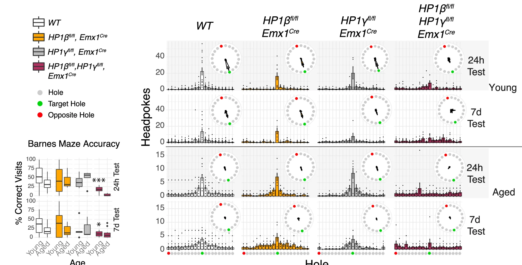
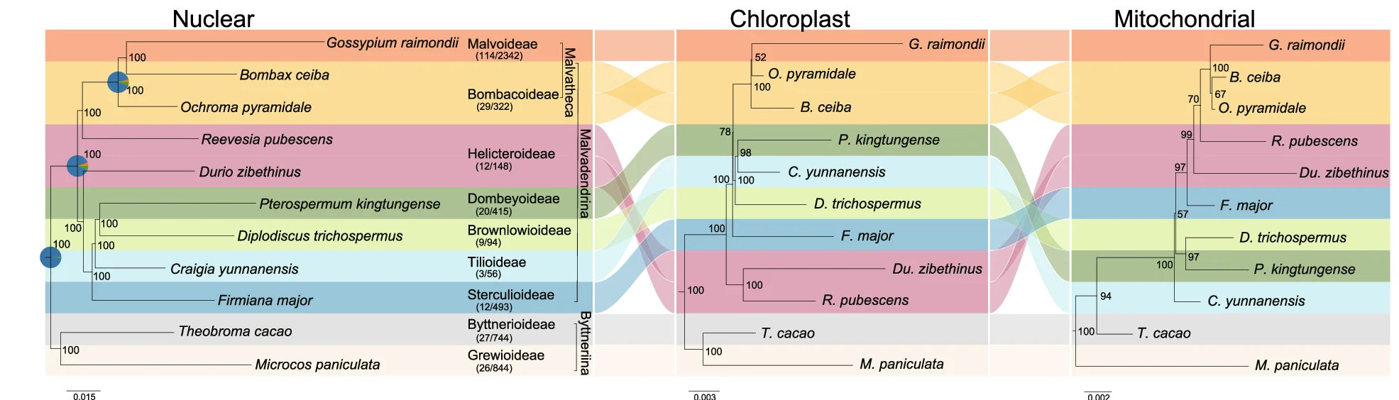
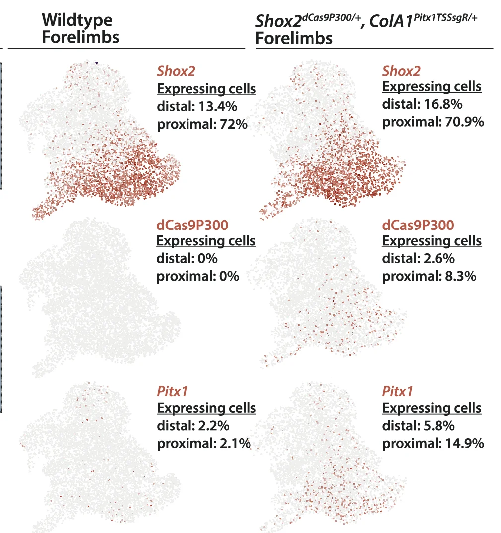
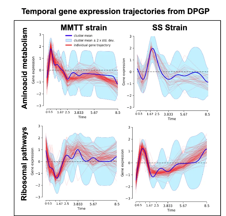
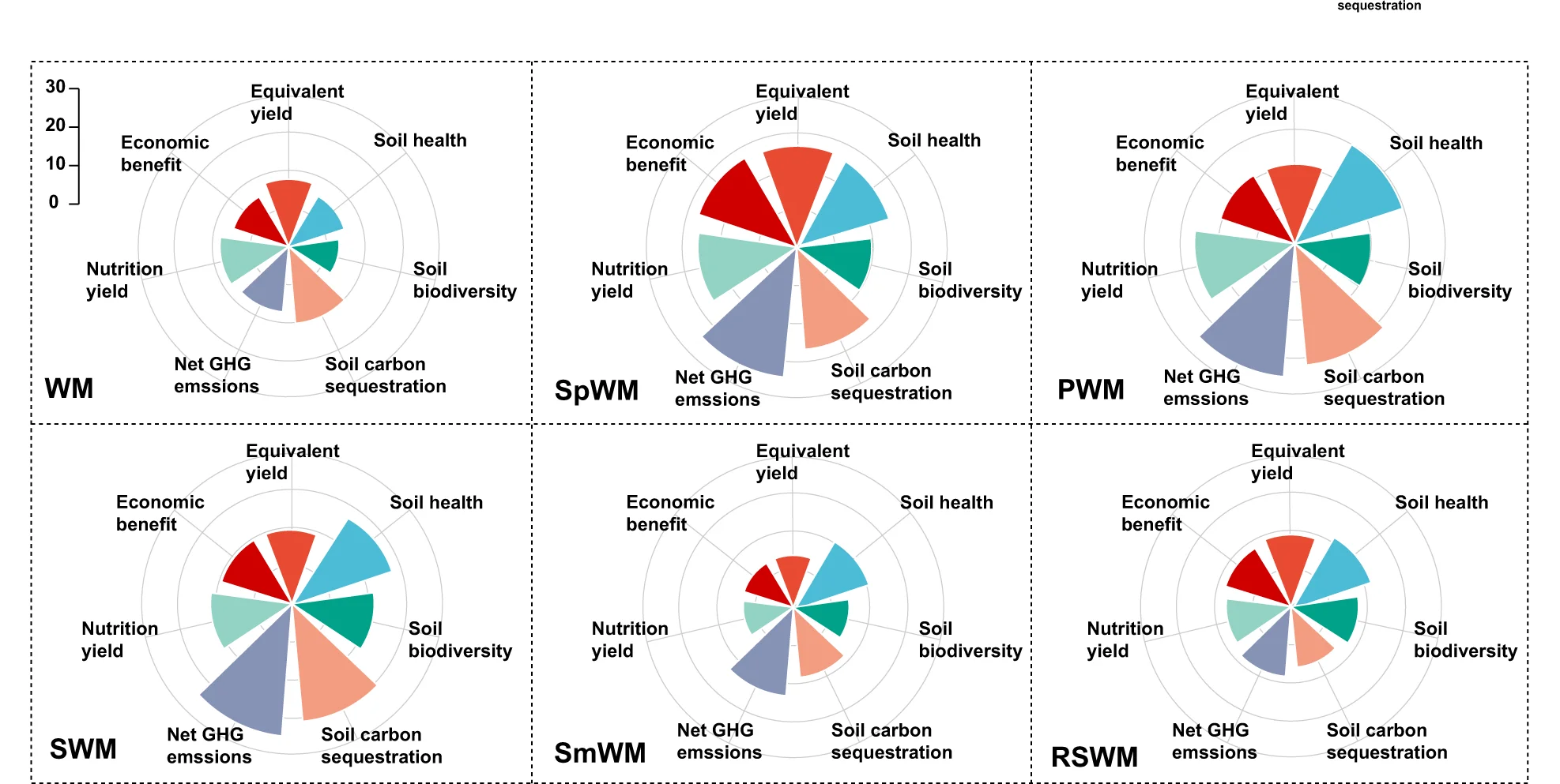
Multiple Panel Plot
Multiple Panel Plots (faceted plots or small multiples) enable powerful multi-dimensional data visualization by displaying related graphs in organized grids. This extensive collection showcases publication-quality examples from diverse scientific fields, demonstrating effective data comparison across conditions, time points, or experimental groups. Perfect for researchers analyzing complex datasets, dose-response curves, time-series data, or multi-condition experiments. Master techniques for creating consistent, publication-ready multi-panel figures using ggplot2 facets, matplotlib subplots, and specialized tools like cowplot and patchwork for professional scientific data visualization.
Flowchart
Flowcharts provide essential visual frameworks for illustrating scientific processes, experimental protocols, and analytical pipelines. This comprehensive collection features publication-quality flowchart examples from bioinformatics workflows, clinical algorithms, and laboratory procedures. Invaluable for researchers documenting computational pipelines, diagnostic pathways, or standard operating procedures. Learn to create clear, professional flowcharts following scientific standards using draw.io, Lucidchart, mermaid diagrams, and specialized workflow visualization tools for reproducible research documentation.
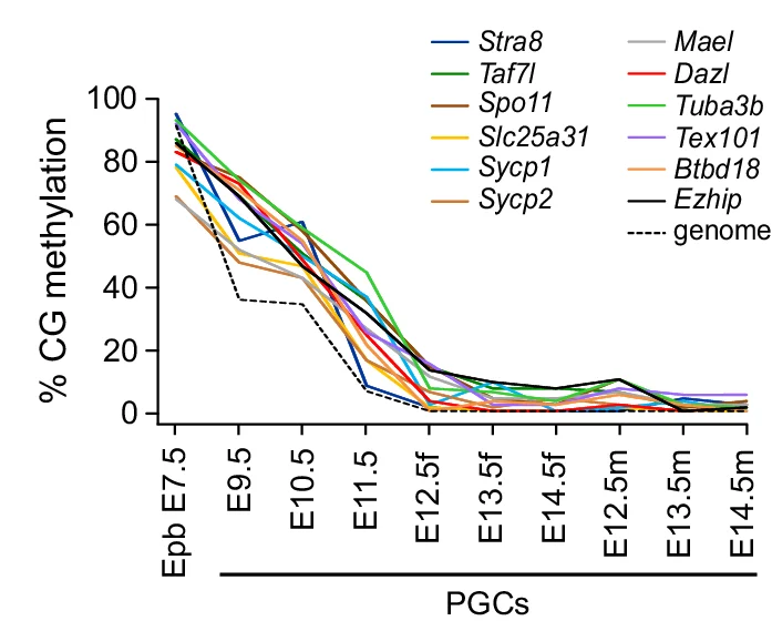
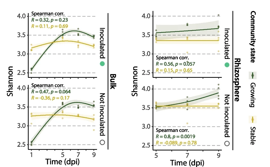
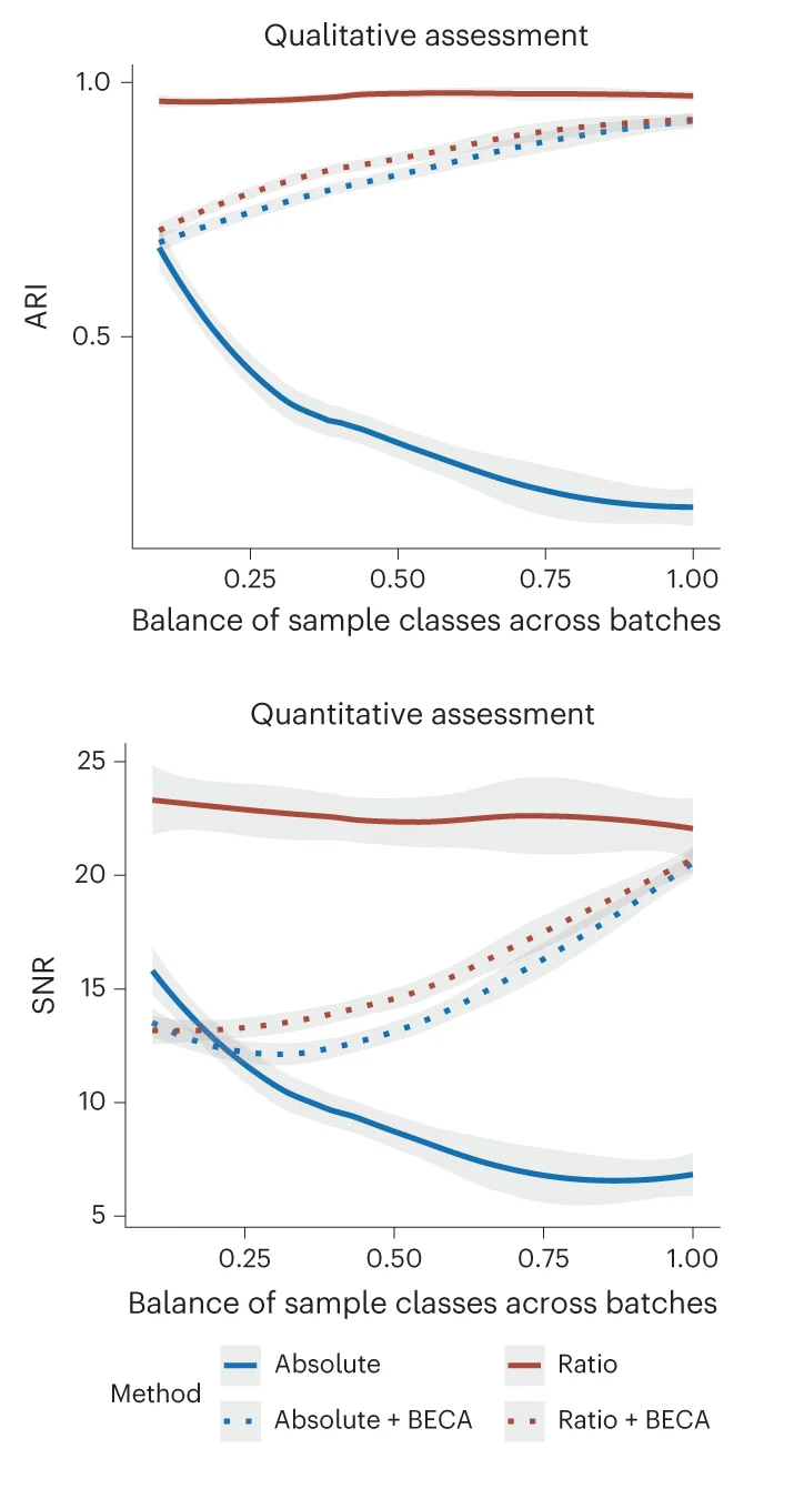
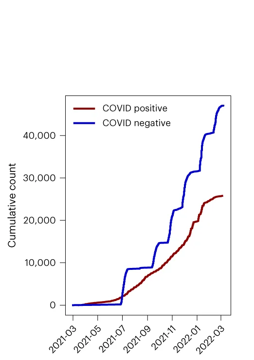
Line Plot
Line Plots excel at showing trends, time-series data, and continuous relationships across all scientific disciplines. This extensive collection features diverse line plot applications from growth curves, reaction kinetics, to climate data visualization. Essential for researchers tracking changes over time, comparing multiple series, or showing dose-response relationships. Discover techniques for creating clear, publication-quality line plots with proper scaling, annotations, and multi-series comparisons using ggplot2, matplotlib, and specialized time-series visualization tools.
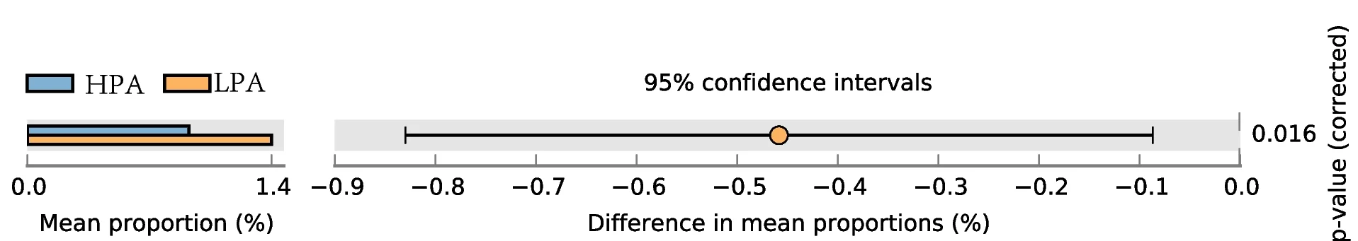
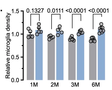
Bar Plot with Error Bars
Bar Plots with Error Bars are fundamental for presenting quantitative comparisons with statistical uncertainty in scientific research. This extensive collection showcases publication-quality examples from molecular biology, clinical trials, and experimental psychology. Critical for researchers displaying means with confidence intervals, standard errors, or standard deviations across experimental conditions. Master proper error bar implementation, statistical annotation, and visual design using ggplot2, matplotlib, GraphPad Prism, and specialized tools for creating accurate, reproducible scientific figures.
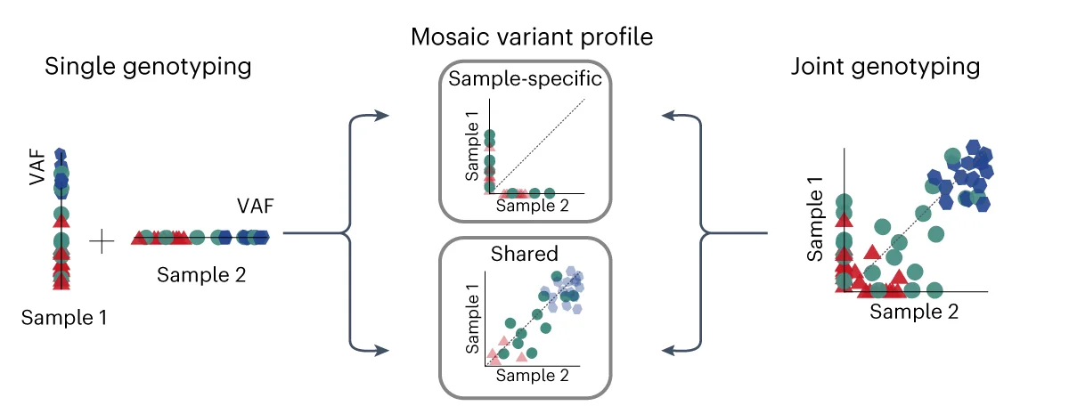
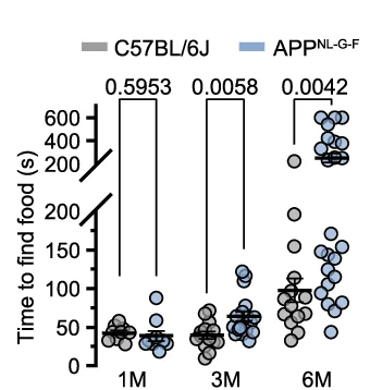
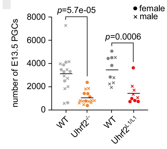
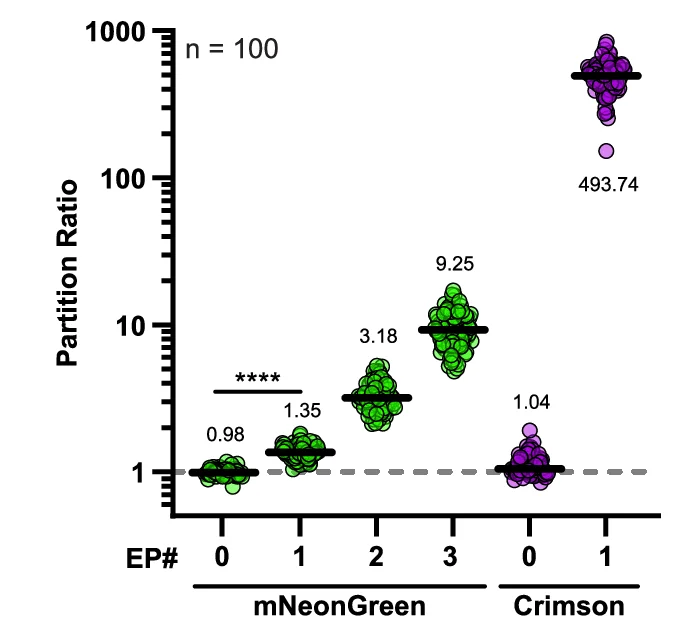
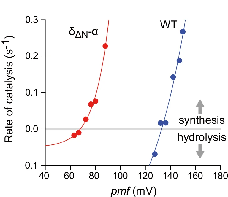
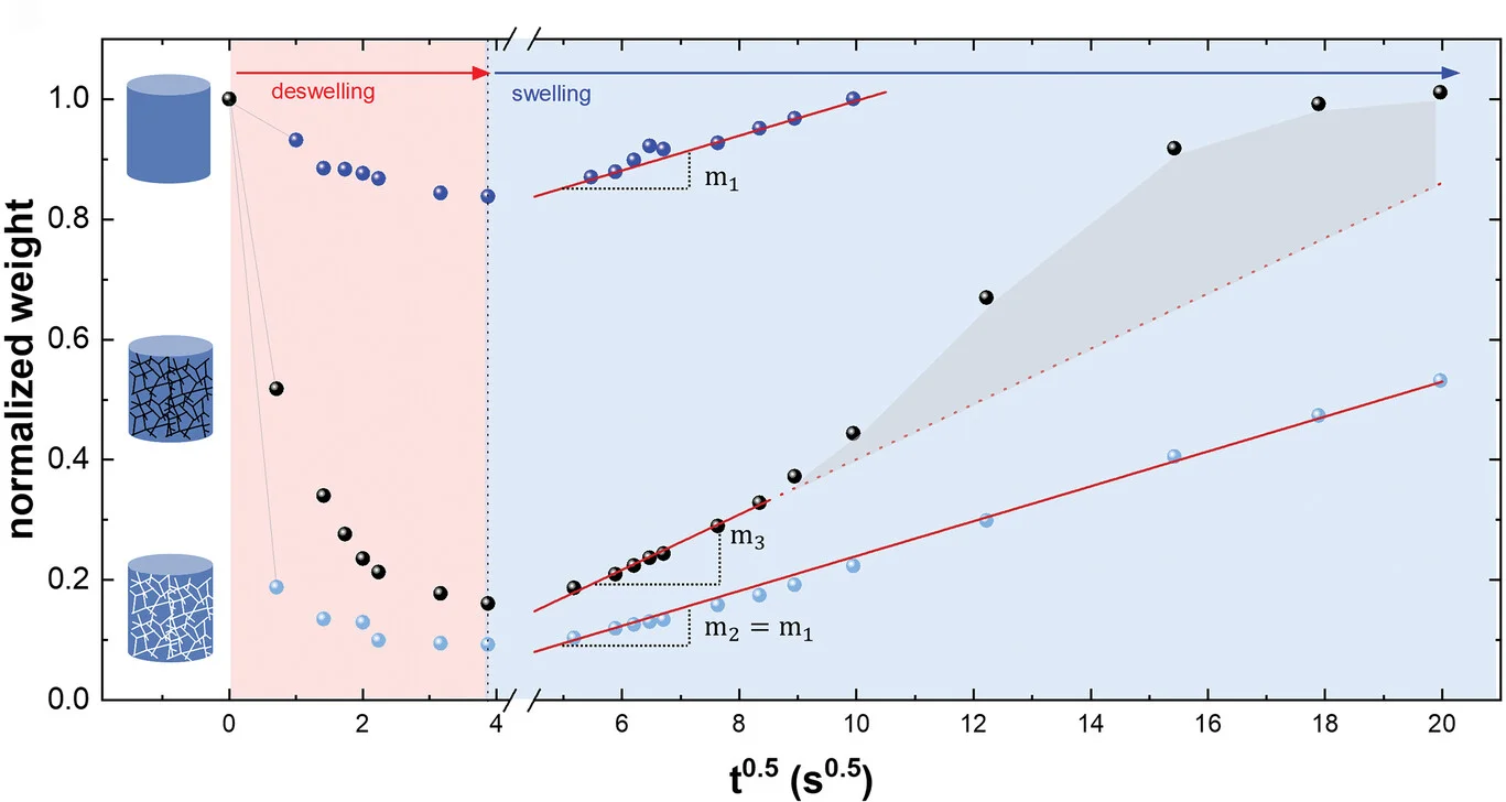
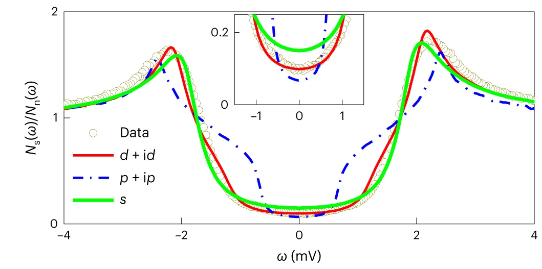
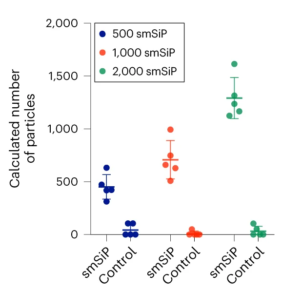
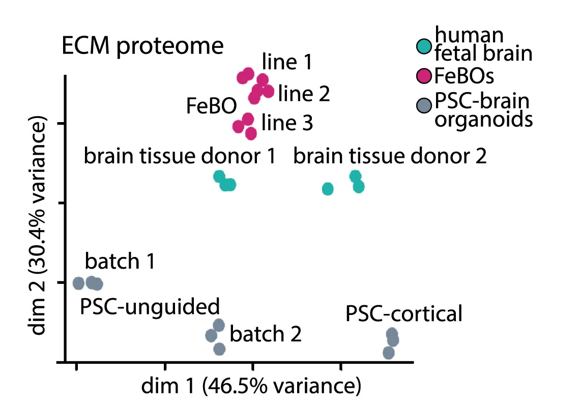
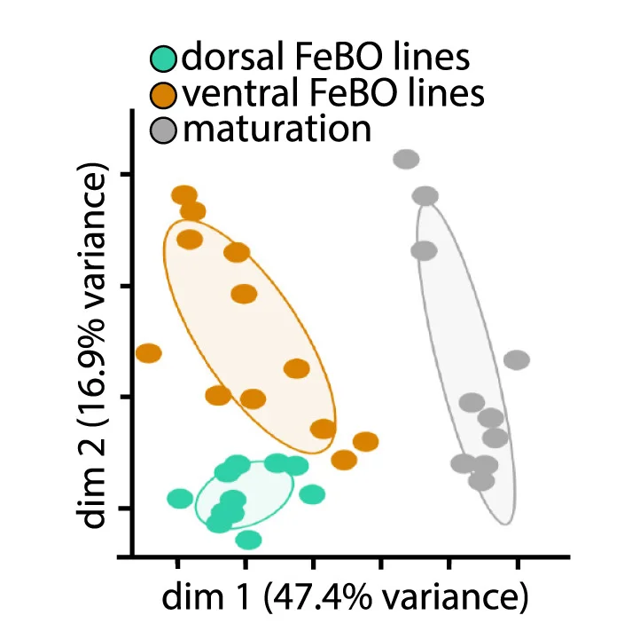
Scatter Plot
Scatter Plots form the foundation of exploratory data analysis across all scientific disciplines, revealing patterns, correlations, and outliers. This extensive collection showcases diverse scatter plot applications from basic correlations to advanced techniques like UMAP dimensionality reduction and PCA visualization. Essential for researchers in genomics, drug discovery, and quantitative biology analyzing high-dimensional data, clustering results, or multivariate relationships. Discover best practices for creating publication-quality scatter plots with proper scaling, coloring, and annotation using ggplot2, matplotlib, seaborn, and specialized tools for scientific data visualization.
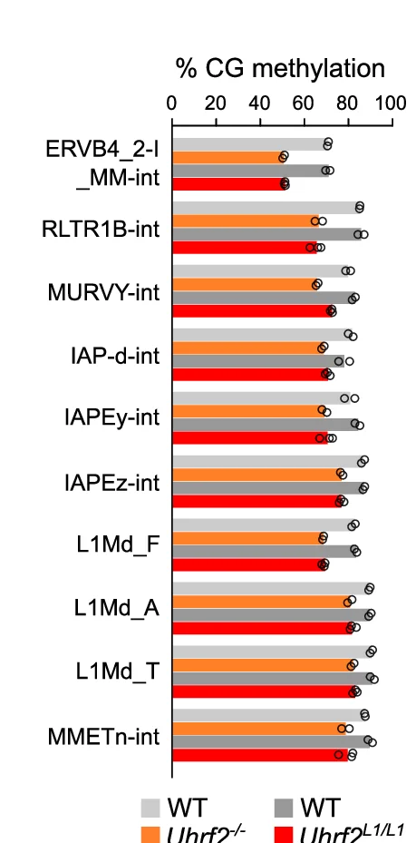
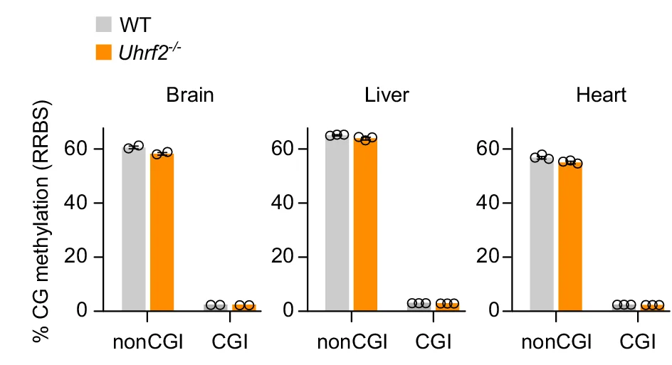
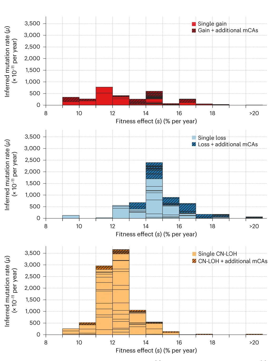
Bar Plot
Bar Plots remain fundamental for comparing categorical data across scientific disciplines, from molecular biology to clinical research. This comprehensive collection features publication-quality bar plot examples demonstrating effective data presentation, error bar usage, and statistical annotation. Essential for researchers presenting gene expression levels, treatment comparisons, or survey results. Master best practices for creating clear, accurate bar plots with proper baseline, spacing, and statistical indicators using ggplot2, matplotlib, GraphPad Prism, and other scientific plotting tools.
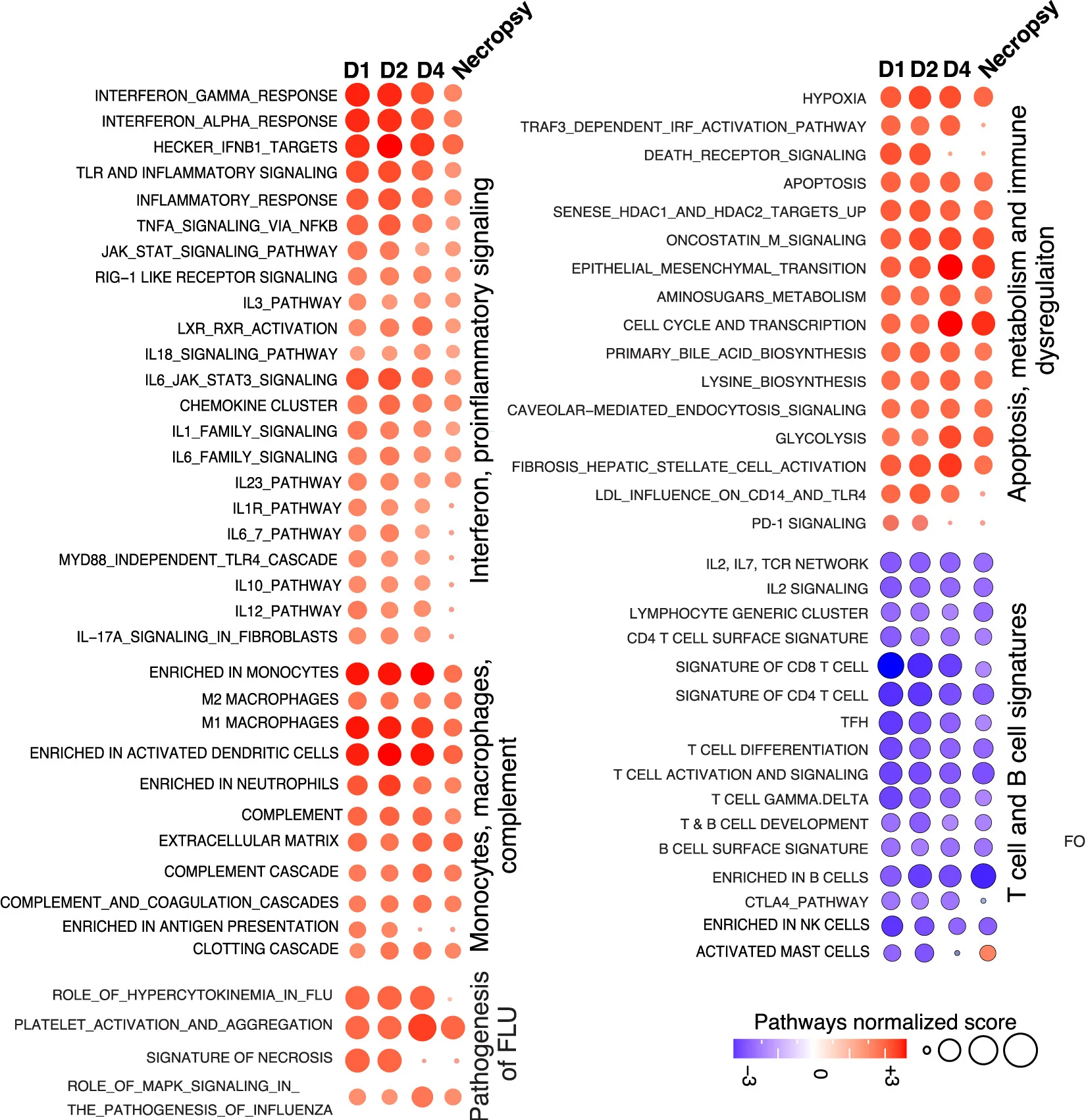
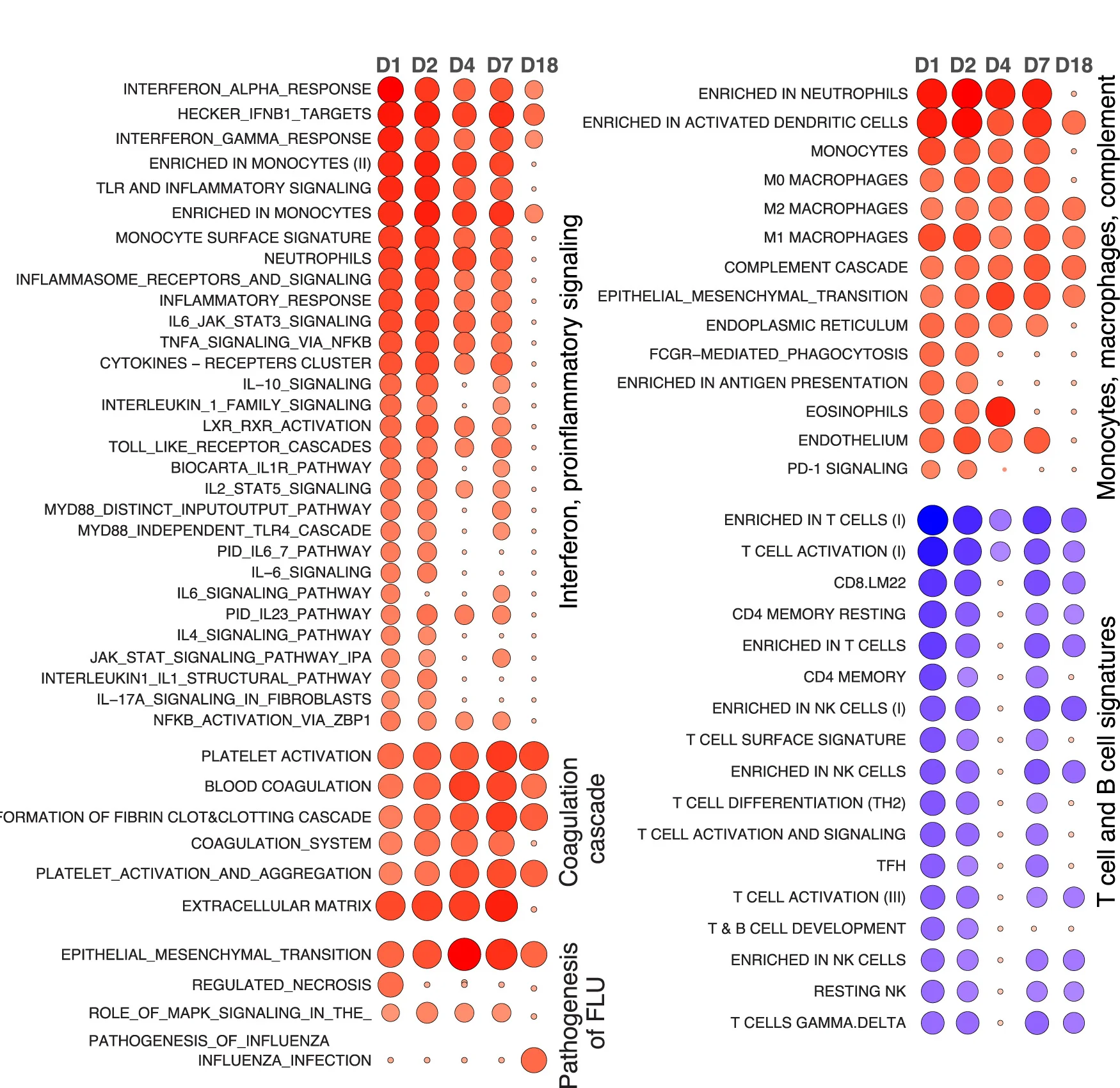
Heatmap
Heatmaps excel at visualizing matrix data patterns in genomics, proteomics, and multivariate analysis across scientific fields. This extensive collection features publication-quality heatmap examples from gene expression profiling, correlation matrices, and spatial data analysis. Critical for researchers performing clustering analysis, differential expression studies, or multi-condition comparisons. Master advanced heatmap techniques including hierarchical clustering, annotation tracks, and color scale optimization using R ComplexHeatmap, Python seaborn, and specialized bioinformatics visualization tools.
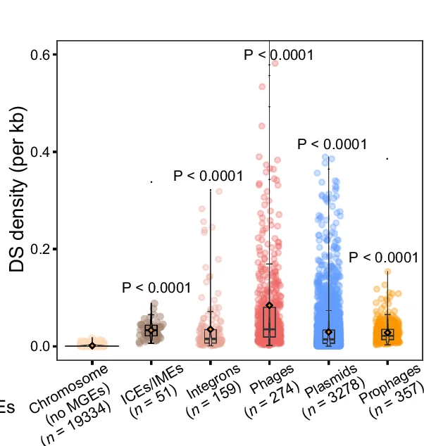
Box Plot
Box Plots (box-and-whisker plots) are statistical workhorses for comparing distributions across groups in experimental research. This comprehensive collection features publication-quality box plot examples from clinical trials, biological experiments, and behavioral studies. Essential for researchers presenting median comparisons, quartile ranges, and outlier identification across multiple conditions. Learn to create informative box plots with statistical annotations, notches, and violin plot overlays using ggplot2, matplotlib, GraphPad Prism, and specialized statistical visualization tools.
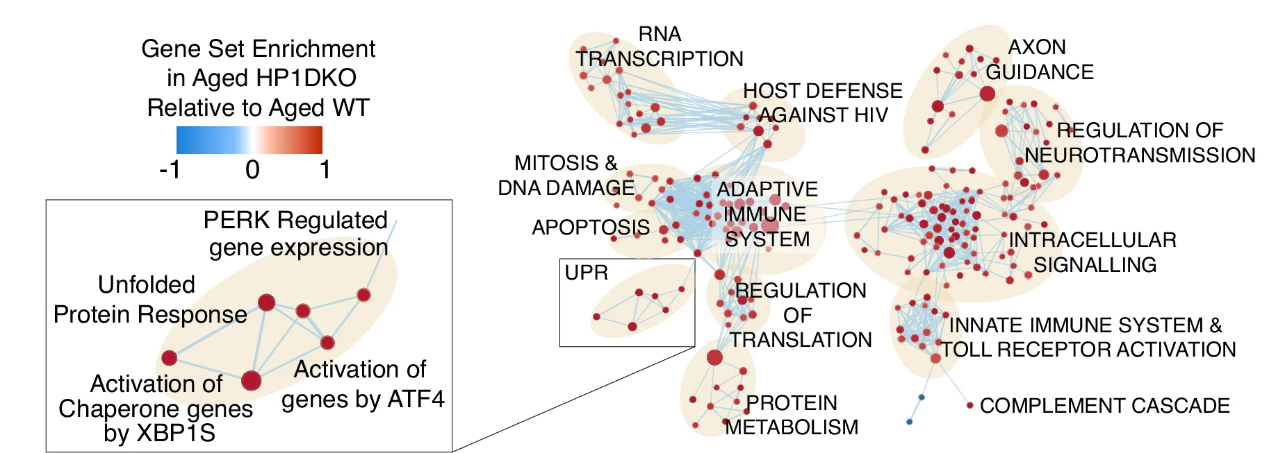
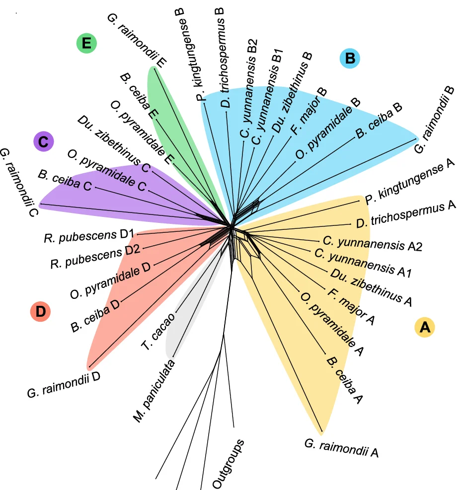
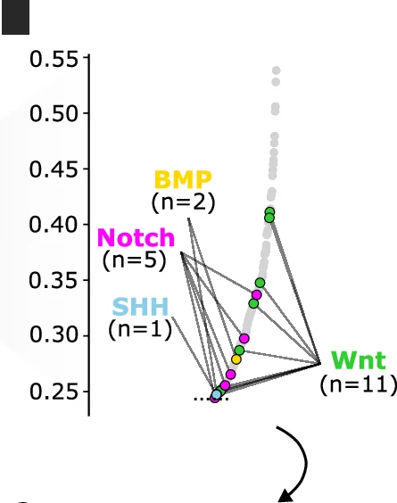
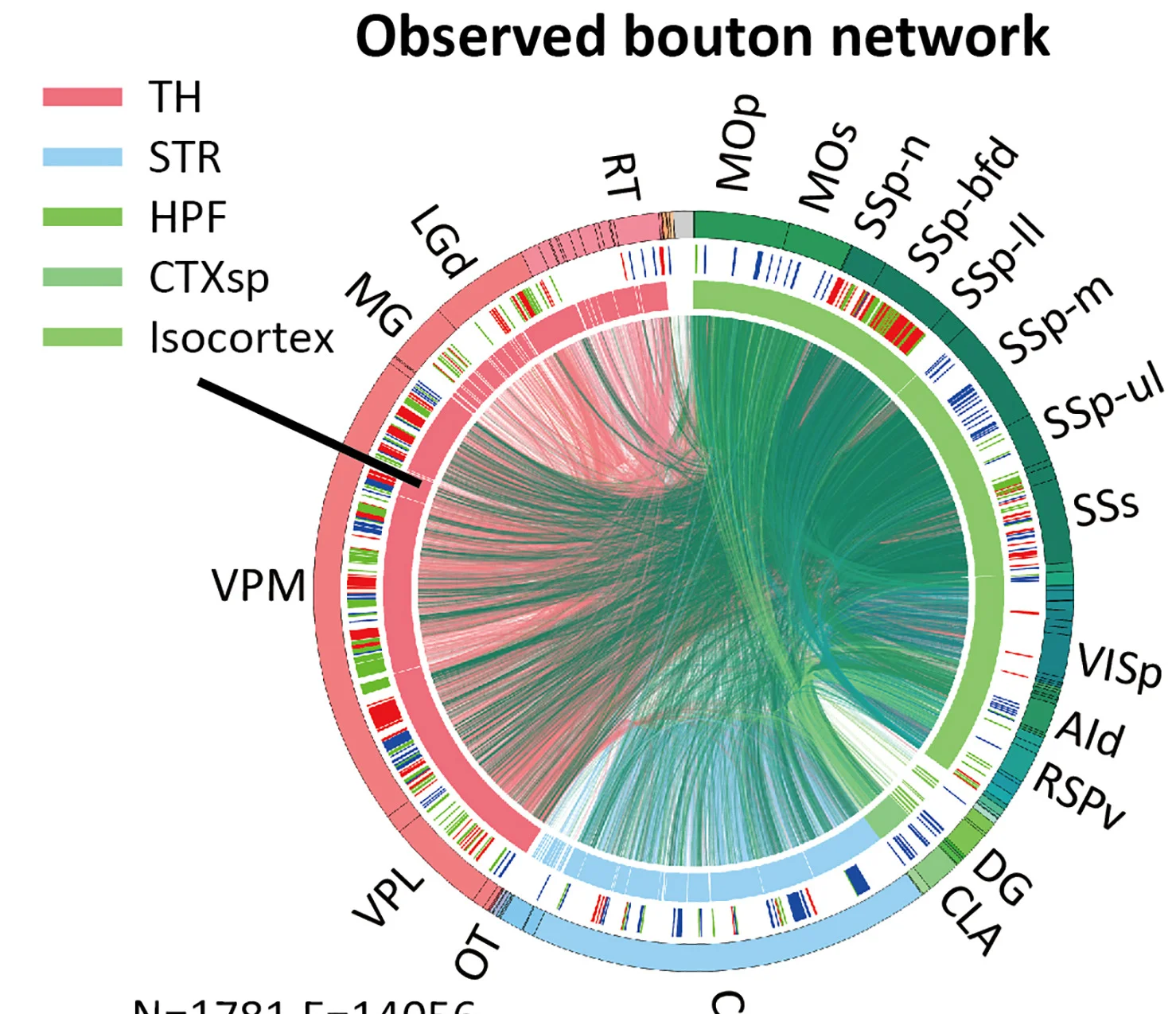
Network
Network Plots reveal complex relationships in biological systems, from molecular interactions to ecological food webs. This comprehensive collection features sophisticated network visualizations from protein-protein interactions, gene regulatory networks, and metabolic pathways. Critical for systems biology researchers, network pharmacologists, and ecological modelers. Master advanced network visualization techniques including force-directed layouts, community detection, and interactive exploration using Cytoscape, Gephi, R igraph, and specialized biological network analysis tools.
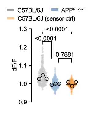
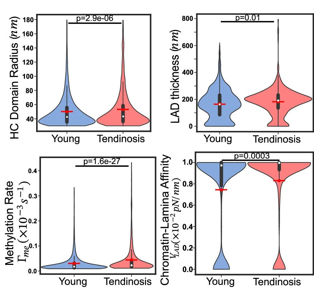
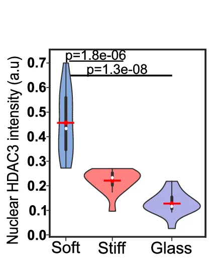
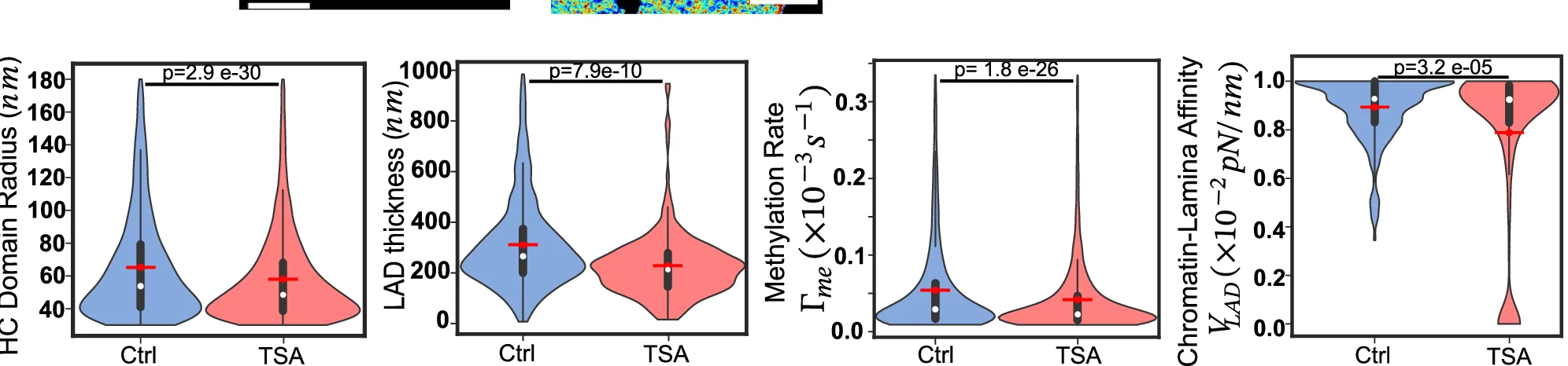
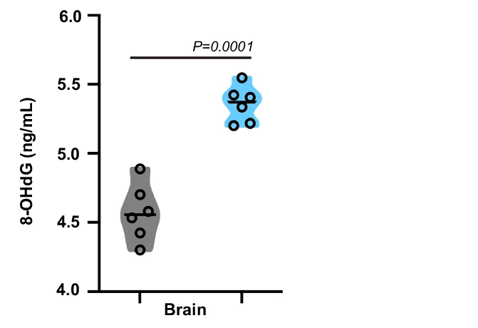
Violin Plot
Violin Plots combine distribution visualization with statistical summary, superior to box plots for revealing data shape and density. This collection showcases elegant violin plot examples from single-cell genomics, clinical biomarkers, and population studies. Perfect for researchers comparing complex distributions, multimodal data, or large sample datasets. Master techniques for creating publication-quality violin plots with statistical overlays, split violins, and hybrid visualizations using ggplot2, seaborn, and specialized tools for advanced distribution analysis.
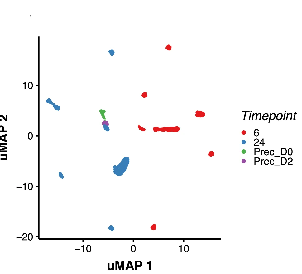
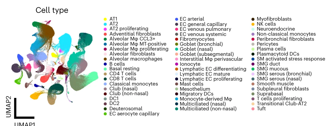
UMAP Plot
A UMAP (Uniform Manifold Approximation and Projection) Plot is a cutting-edge technique for dimensionality reduction and data visualization. It is particularly powerful for exploring the structure of large, high-dimensional datasets. UMAP excels at preserving both the local and global structure of the data in a low-dimensional space (typically 2D or 3D). This makes it invaluable in fields like bioinformatics for visualizing single-cell RNA-sequencing data, or in machine learning for understanding complex feature spaces. Use a UMAP plot to uncover hidden clusters, relationships, and manifold structures that other methods might miss, providing profound insights into complex data.
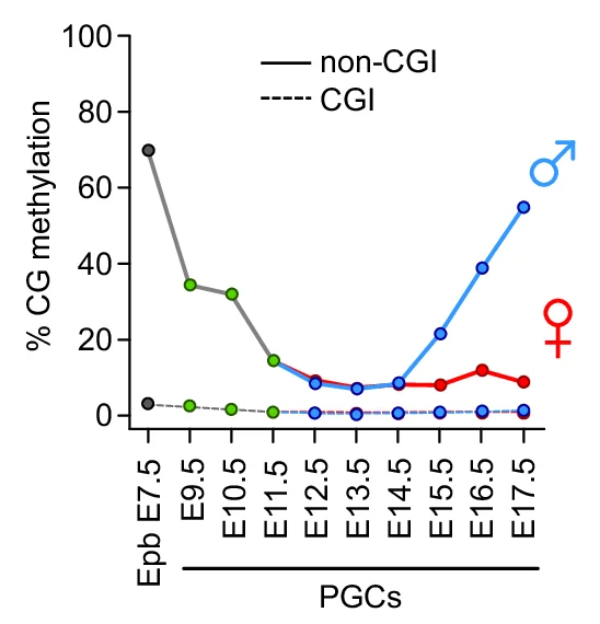
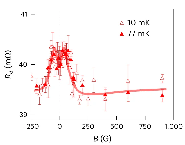
Line Plot with Error Bars
For a more rigorous approach to time-series and experimental data, the Line Plot with Error Bars is an invaluable tool. It enhances the standard line plot by adding error bars to each data point, illustrating the uncertainty or variability at each measurement interval. This is particularly useful in scientific fields for representing confidence intervals or standard errors of a mean over time. By visualizing both the trend and its statistical precision, you can make more informed judgments about the data's reliability and the significance of observed changes. This chart is essential for presenting experimental results transparently, enabling a deeper and more accurate interpretation of trends.
Study Design
Study Design Diagrams provide essential visual roadmaps for research methodology, crucial for clinical trials, experimental protocols, and systematic reviews. This collection features clear, professional study design visualizations from high-impact publications, including CONSORT diagrams, experimental workflows, and sampling strategies. Invaluable for researchers planning RCTs, cohort studies, or complex experimental designs. Learn to create transparent, reproducible study design figures using specialized tools like draw.io, Lucidchart, and R packages for CONSORT flow diagrams that meet publication standards.
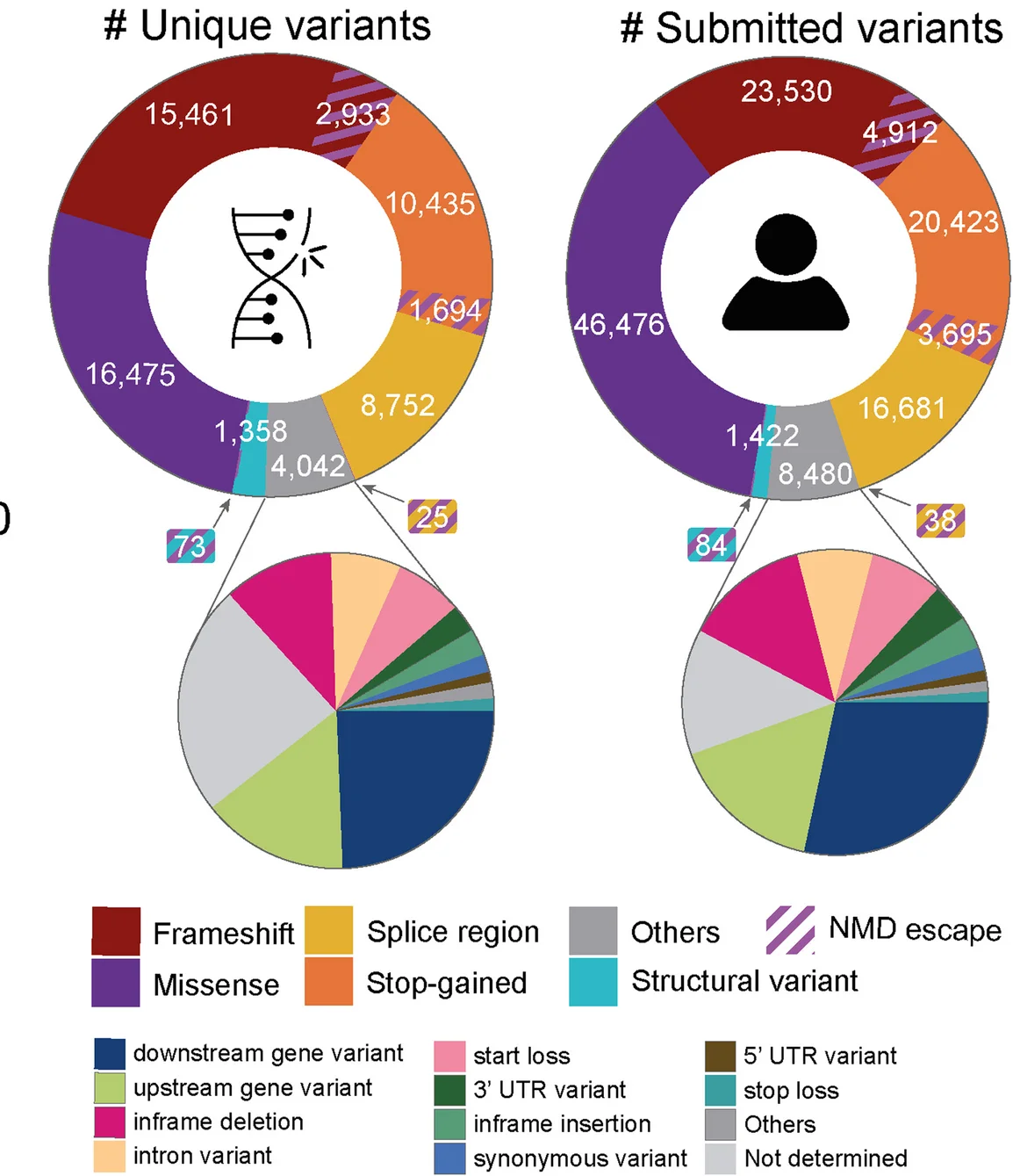
![Schematic of analytical test for the recurrence of de novos that considers distal splice-altering and exonic SNV and indel variants, their variant functionality scores, a genome-wide mutation rate model Roulette, and per-gene GeneBayes constraint values. “Like” variants refer to those of the same variant class (i.e., coding SNVs [ CS ], coding indels [ CI ], intronic SNVs [ IS ], intronic indels [ II ]) and within the same functionality score and minor allele frequency thresholds.](https://i.plottie.art/subplots/10.1038_s41467-025-61712-2/fig_2_b.webp)
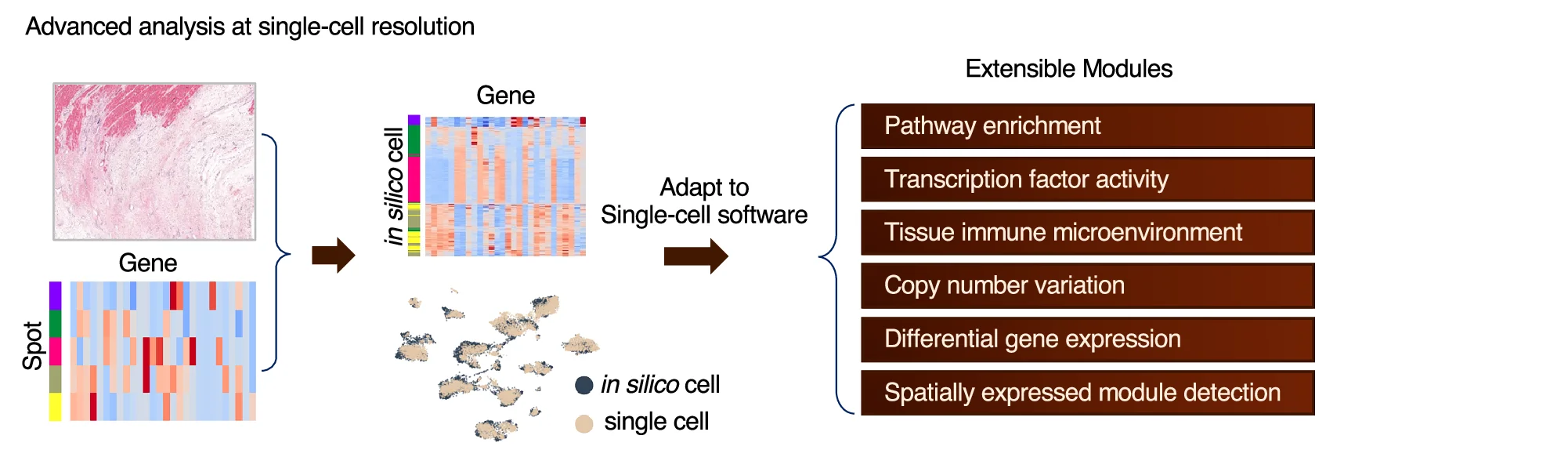
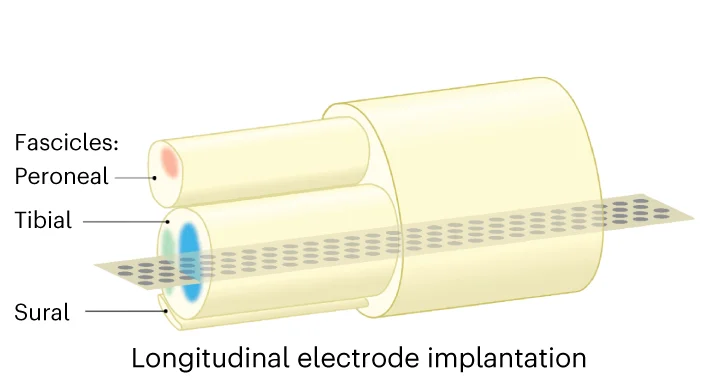
Workflow Diagram
Workflow Diagrams document complex research processes, computational pipelines, and experimental procedures with clarity and precision. This collection showcases professional workflow visualizations from bioinformatics pipelines, clinical protocols, and laboratory methods. Essential for researchers ensuring reproducibility, training personnel, or documenting standard procedures. Discover best practices for creating clear, detailed workflow diagrams using specialized tools like Nextflow, WDL visualization, draw.io, and scientific workflow management systems.
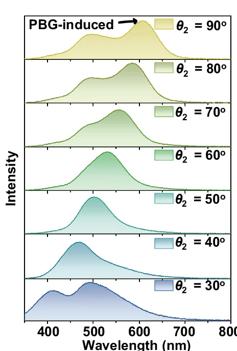
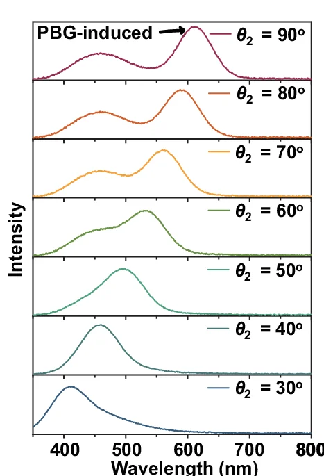
Density Plot
A Density Plot provides a beautiful and intuitive way to visualize the distribution of a continuous variable. It works by smoothing out the data points to create a continuous curve, offering a clearer representation of the underlying probability distribution than a traditional histogram. This plot is excellent for exploring the shape of your data, identifying peaks (modes), and understanding where the data points are concentrated. Whether you're analyzing income distribution, measurement data, or any continuous dataset, the density plot helps reveal patterns that might be missed with other charts. It is a key tool for exploratory data analysis and statistical modeling.
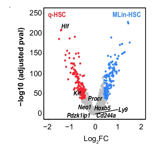
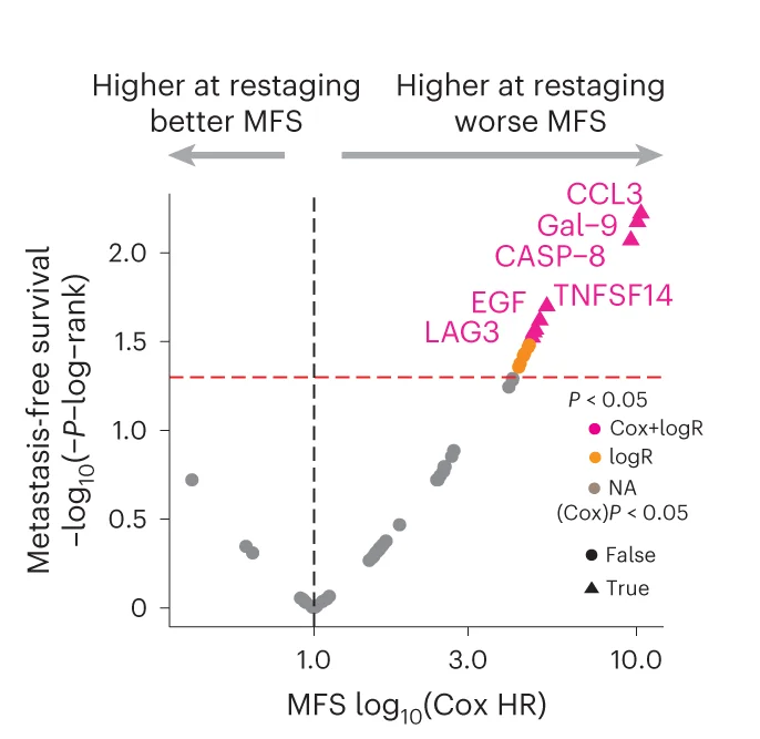
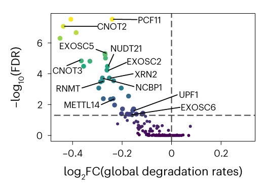
Volcano Plot
Volcano Plots are indispensable for visualizing differential expression in omics studies, combining fold change with statistical significance. This collection presents outstanding volcano plot examples from RNA-seq, proteomics, and metabolomics publications. Essential for researchers identifying differentially expressed genes, proteins, or metabolites in high-throughput experiments. Explore advanced techniques for creating publication-quality volcano plots with proper thresholds, labeling, and color coding using R packages like EnhancedVolcano, ggplot2, and specialized bioinformatics tools.
Pathway Diagram
Pathway Diagrams are fundamental visualization tools for illustrating biological pathways, metabolic networks, and signaling cascades in life sciences research. This curated collection features publication-quality pathway diagram examples from leading journals, showcasing KEGG pathways, gene regulatory networks, protein-protein interactions, and cellular signaling mechanisms. Perfect for molecular biologists, biochemists, and systems biology researchers creating figures for scientific publications. Find inspiration for visualizing complex biological processes, drug targets, disease mechanisms, and multi-omics data integration using tools like Cytoscape, PathVisio, and BioRender.
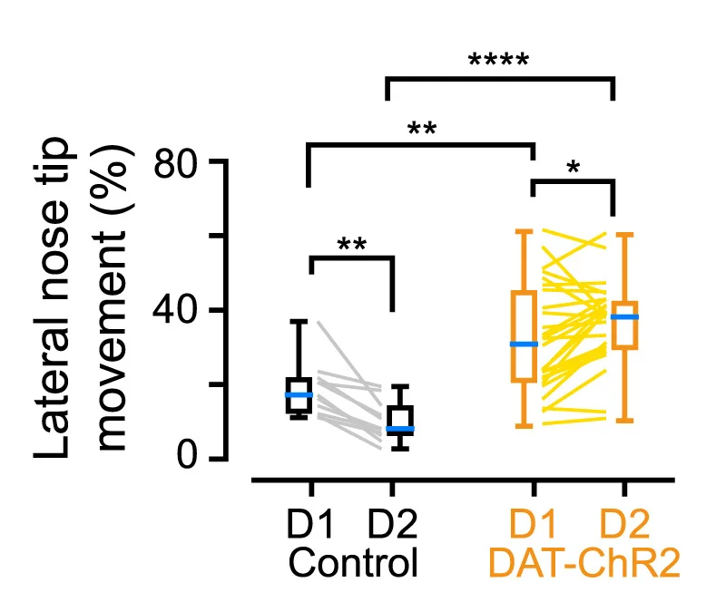
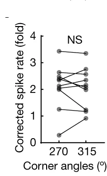
Paired Dot Plot
Paired Dot Plots excel at visualizing before-and-after comparisons, treatment effects, and matched sample analyses in biomedical research. This collection features publication-ready paired dot plot examples demonstrating statistical comparisons, clinical trial results, and experimental interventions. Perfect for researchers presenting paired t-test results, repeated measures data, or matched case-control studies. Learn effective techniques for showing individual data points, connecting lines, and statistical significance using ggplot2 paired plots, GraphPad Prism, and Python seaborn for creating transparent, reproducible scientific figures.
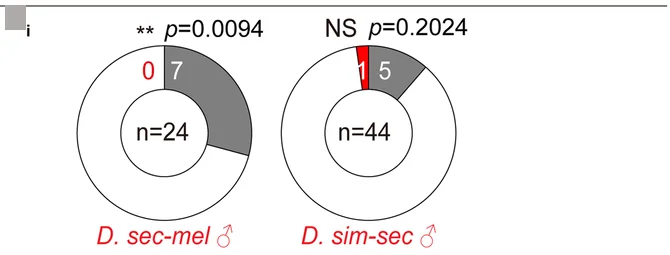
![Illustration of the unnormalized squared mutational target computed for each observed comphet variant in a gene across the cohort (RaMeDiES-CH, Supplementary Fig. 11 ) or in an individual across the genome (RaMeDiES-IND, Supplementary Fig. 12 ). Like variants refer to those of the same variant class (i.e., coding SNVs [ CS ], coding indels [ CI ], intronic SNVs [ IS ], intronic indels [ II ]) and within the same functionality score and minor allele frequency thresholds.](https://i.plottie.art/subplots/10.1038_s41467-025-61712-2/fig_3_a.webp)
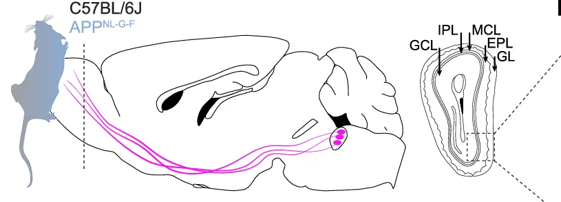
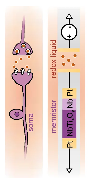
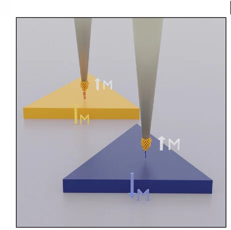
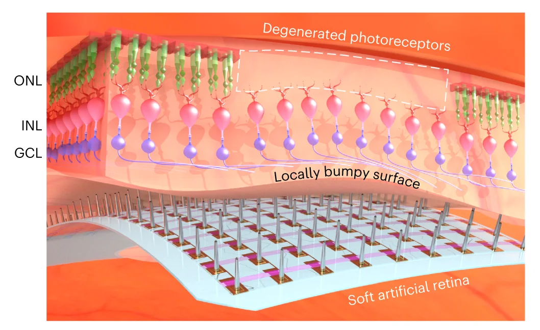
Hypothesis Illustration
Hypothesis Illustrations transform complex scientific theories into clear visual narratives, essential for grant proposals, review articles, and research presentations. This curated collection showcases conceptual diagrams, theoretical frameworks, and mechanistic models from top-tier publications. Ideal for researchers communicating novel hypotheses, experimental designs, or theoretical models in fields ranging from neuroscience to ecology. Explore effective visual storytelling techniques using Adobe Illustrator, BioRender, PowerPoint, and specialized scientific illustration tools to create compelling hypothesis visualizations that enhance research communication.
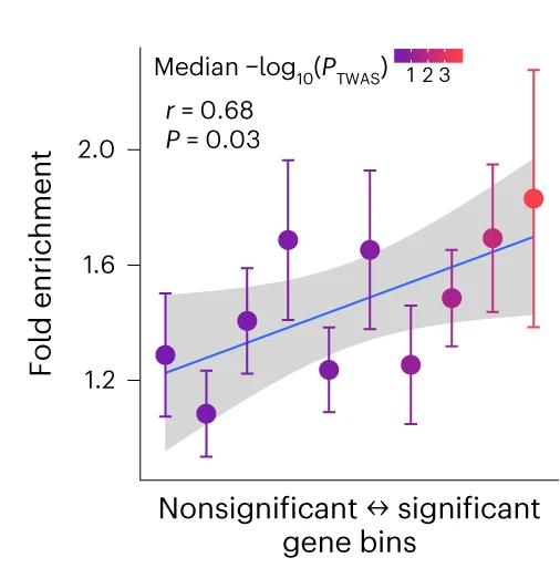
Bubble Plot
Bubble Plots elegantly visualize three-dimensional data relationships through position and size encoding, ideal for multivariate scientific data analysis. This collection presents sophisticated bubble plot examples from genomics, epidemiology, and environmental science publications. Perfect for researchers visualizing gene expression with p-values, population health metrics, or ecological abundance data. Explore advanced techniques for creating informative bubble charts with proper scaling, color coding, and annotations using ggplot2, plotly, and D3.js for interactive scientific data visualization.
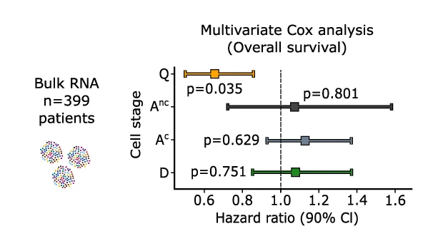
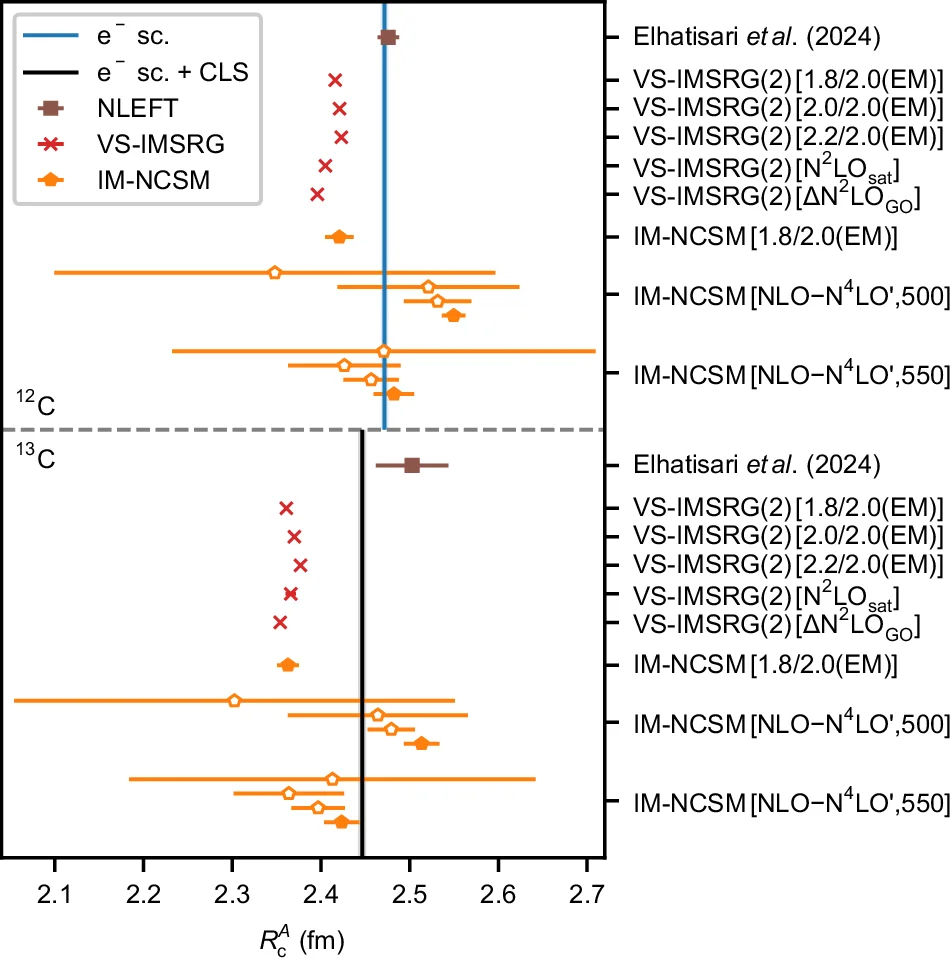
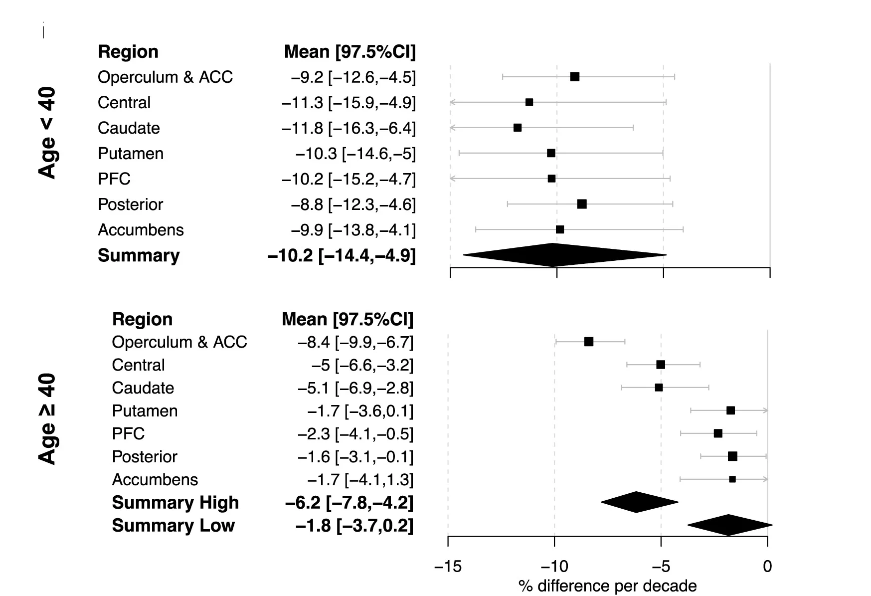
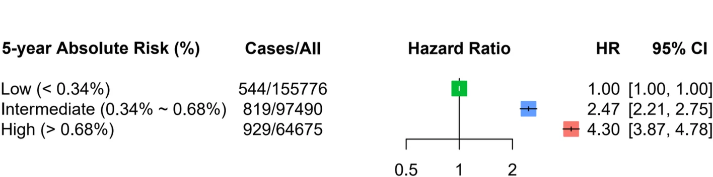
Forest Plot
Forest Plots are the gold standard for meta-analysis visualization, displaying effect sizes and confidence intervals across multiple studies. This collection showcases exemplary forest plots from systematic reviews, clinical meta-analyses, and evidence synthesis publications. Critical for researchers conducting Cochrane reviews, clinical guidelines, or comparative effectiveness research. Learn to create professional forest plots showing pooled effects, heterogeneity statistics, and subgroup analyses using specialized R packages like meta, metafor, and forestplot for publication-ready meta-analysis figures.
Regression Plot
Regression Plots visualize statistical relationships between variables, essential for predictive modeling and correlation analysis. This collection presents publication-quality regression plot examples from dose-response studies, calibration curves, and predictive models. Perfect for researchers performing linear regression, logistic regression, or non-linear modeling in experimental sciences. Learn to create informative regression plots with confidence bands, residual diagnostics, and model comparison using ggplot2, seaborn, and specialized statistical visualization packages.
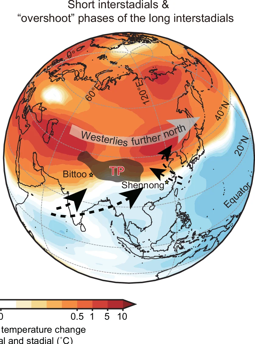
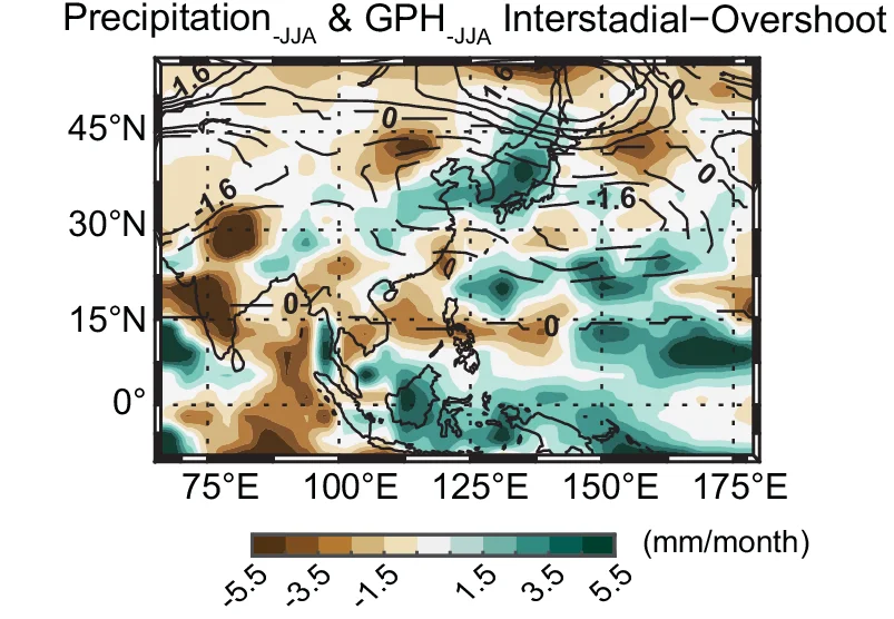
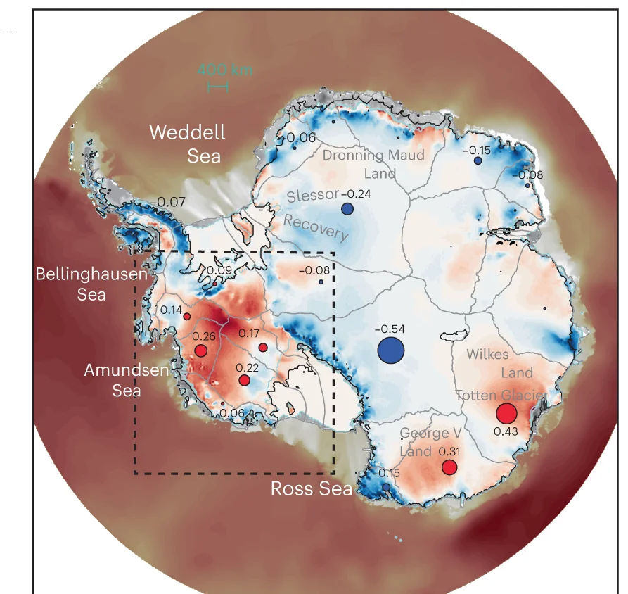
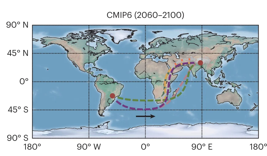
Geo Map
Geo Maps (choropleth maps) powerfully visualize spatial data patterns in epidemiology, ecology, and public health research. This collection features high-quality geographic visualizations from disease surveillance, environmental monitoring, and population health studies. Essential for researchers analyzing geographic disparities, disease spread, or environmental gradients. Discover techniques for creating informative maps with proper projections, color scales, and statistical overlays using R packages like ggmap, leaflet, and specialized GIS tools for scientific spatial data visualization.
Ridge Plot
A Ridge Plot, also known as a joyplot, is a visually striking chart that allows you to compare the distributions of a continuous variable across several different categories. It consists of a series of density plots that are partially overlapped, creating an effect reminiscent of a mountain range. This arrangement makes it incredibly effective for visualizing how a distribution changes from one group to another, such as illustrating changes in temperature over different months or exam scores across various schools. The ridge plot offers a compact and compelling alternative to faceting, providing a clear, high-data-density view that is both informative and aesthetically pleasing.
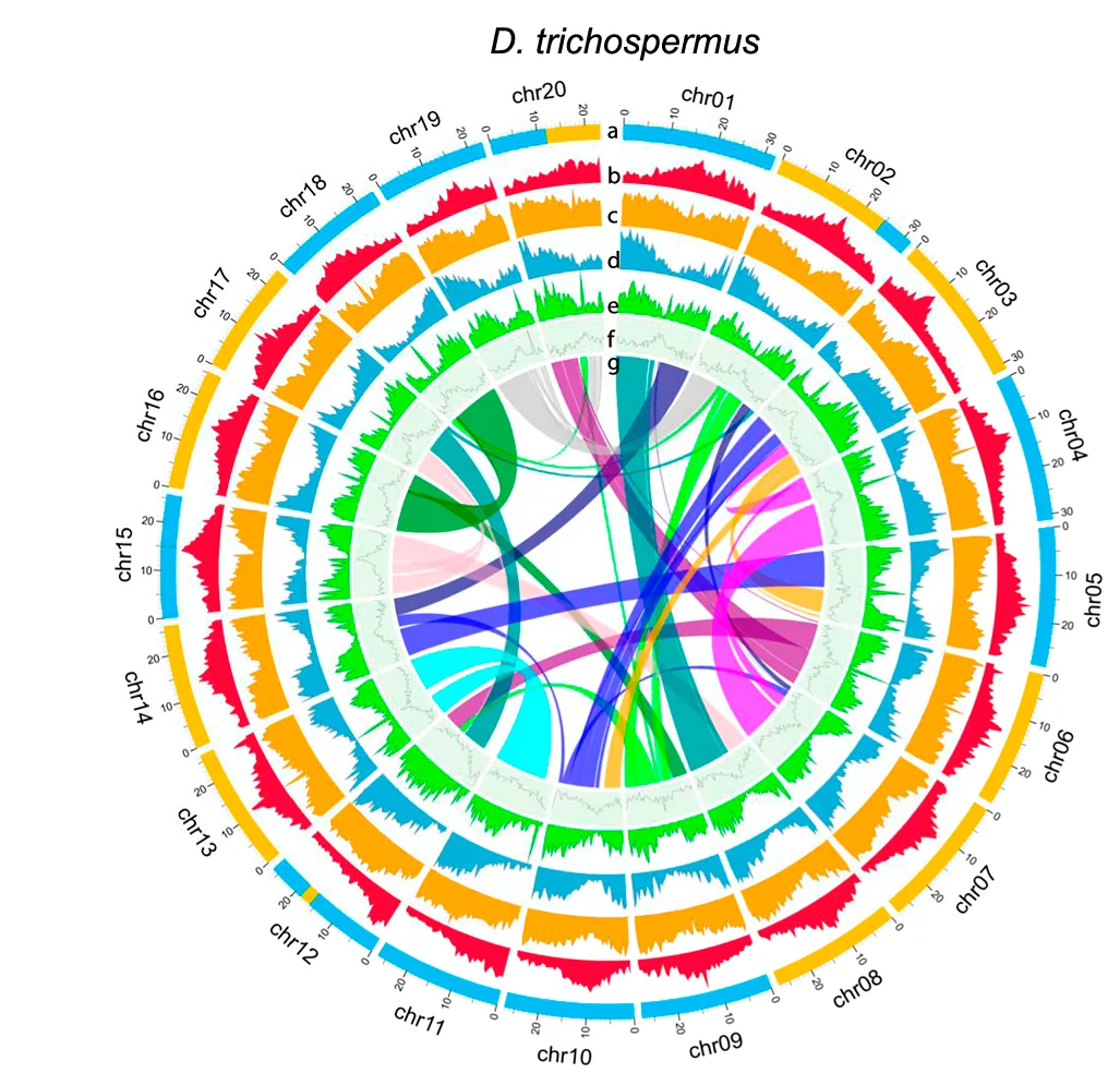
Genome Coverage Profile
Genome Coverage Profiles visualize sequencing depth and read distribution across genomic regions, essential for next-generation sequencing (NGS) data analysis. This collection presents exemplary coverage plots from ChIP-seq, RNA-seq, ATAC-seq, and whole-genome sequencing studies published in high-impact journals. Ideal for bioinformaticians and genomics researchers analyzing peak calling, transcriptome profiling, and chromatin accessibility. Discover effective visualization techniques for IGV browser tracks, bedGraph files, and bigWig data using tools like deepTools, UCSC Genome Browser, and custom R/Python scripts for publication-quality genomics figures.
Scatter Plot with Error Bars
Scatter Plots with Error Bars combine data relationships with measurement uncertainty, crucial for rigorous scientific data presentation. This collection showcases publication-quality examples from experimental physics, analytical chemistry, and quantitative biology. Perfect for researchers presenting calibration curves, dose-response relationships, or correlation analyses with confidence intervals. Master techniques for properly displaying measurement error, propagating uncertainties, and creating transparent scientific figures using specialized plotting libraries and error propagation tools.
Raincloud Plot
Raincloud Plots represent the gold standard for transparent data visualization, combining raw data, distributions, and summary statistics. This collection features state-of-the-art raincloud plot examples from psychology, neuroscience, and biomedical research. Essential for researchers committed to open science and reproducible data presentation. Learn to create comprehensive raincloud plots showing individual points, density distributions, and box plot summaries using R raincloudplots, Python ptitprince, and custom implementations for maximum data transparency.
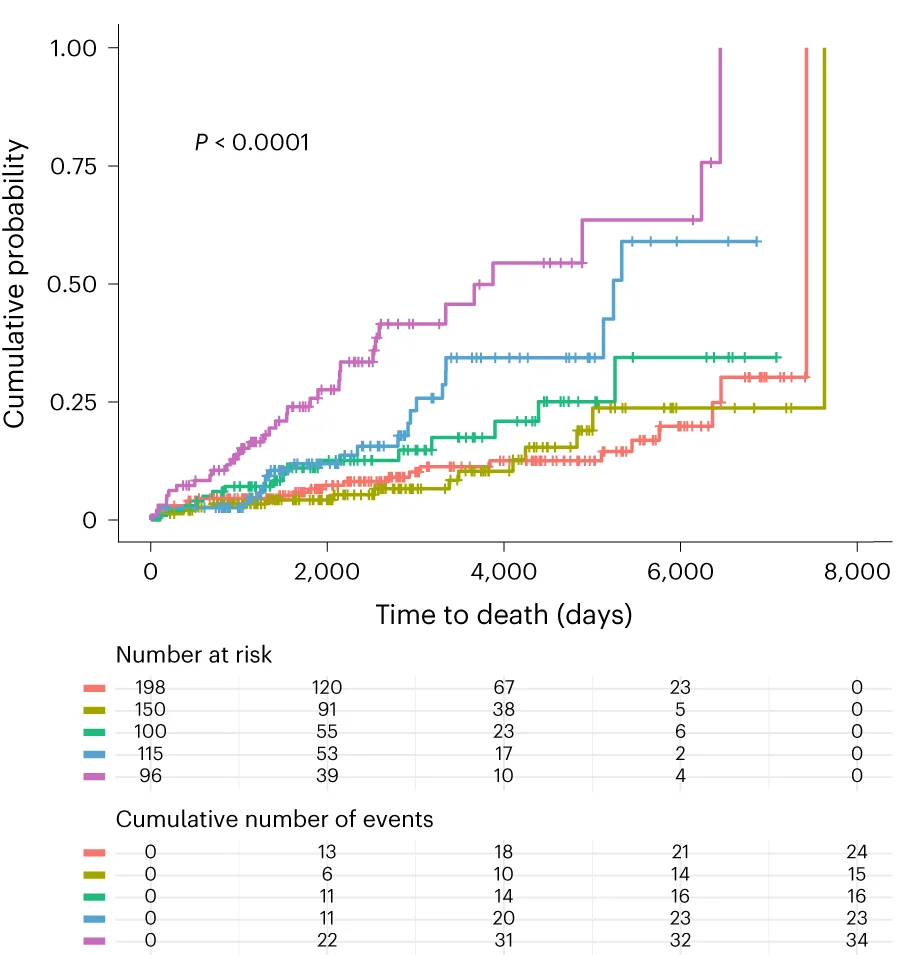
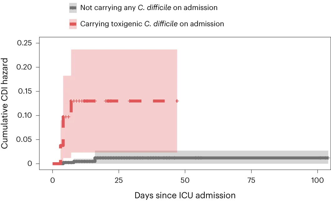
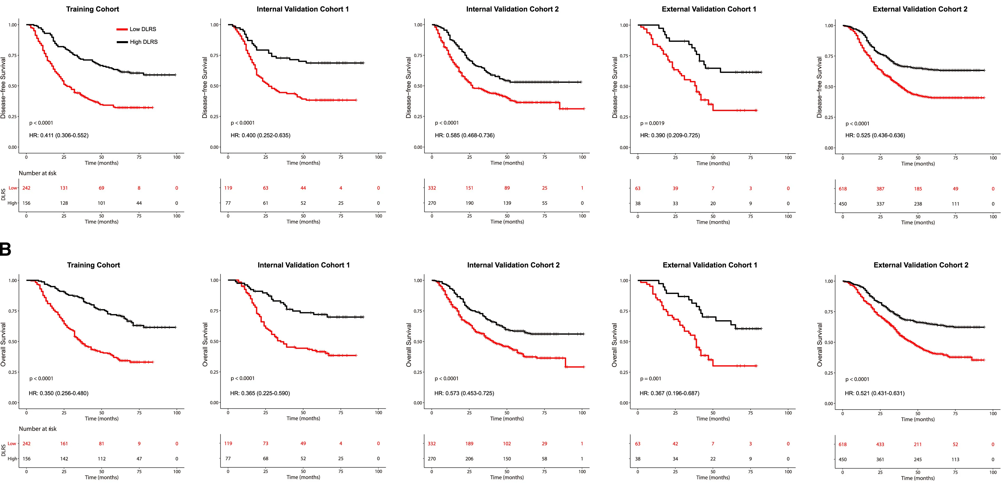
Survival Curve
Survival Curves (Kaplan-Meier plots) are essential for time-to-event analysis in clinical trials and epidemiological studies. This collection showcases exemplary survival curve examples from oncology research, reliability engineering, and longitudinal studies. Critical for researchers analyzing patient outcomes, treatment efficacy, or failure time data. Master techniques for creating publication-quality survival curves with confidence intervals, risk tables, and log-rank test results using R survminer, Python lifelines, and specialized survival analysis packages.
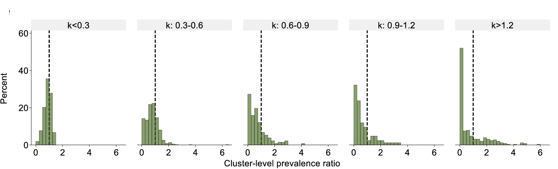
Histogram
A Histogram is a classic and essential tool for visualizing the distribution of a single continuous variable. It groups data into a series of bins or intervals and displays the frequency of observations in each bin as a bar. This provides a clear, at-a-glance understanding of the data's underlying distribution, including its central tendency, spread, skewness, and modality (the number of peaks). Histograms are fundamental to exploratory data analysis, helping you to understand your data's characteristics before applying more complex statistical methods. They are perfect for analyzing exam scores, heights, weights, or any numerical dataset.
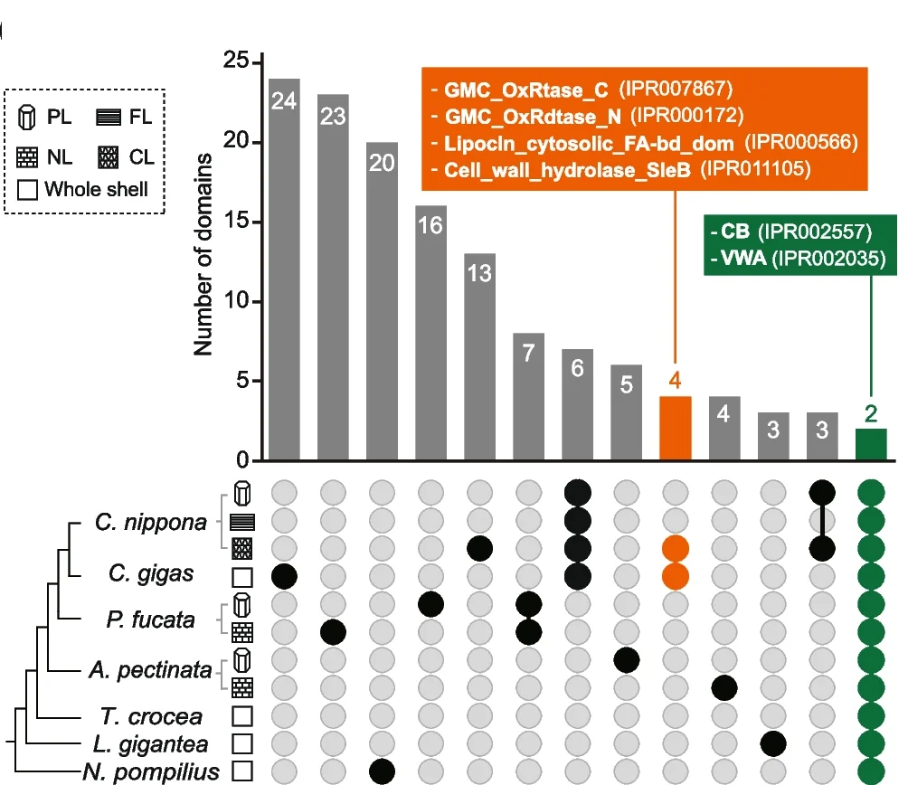
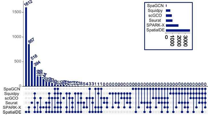
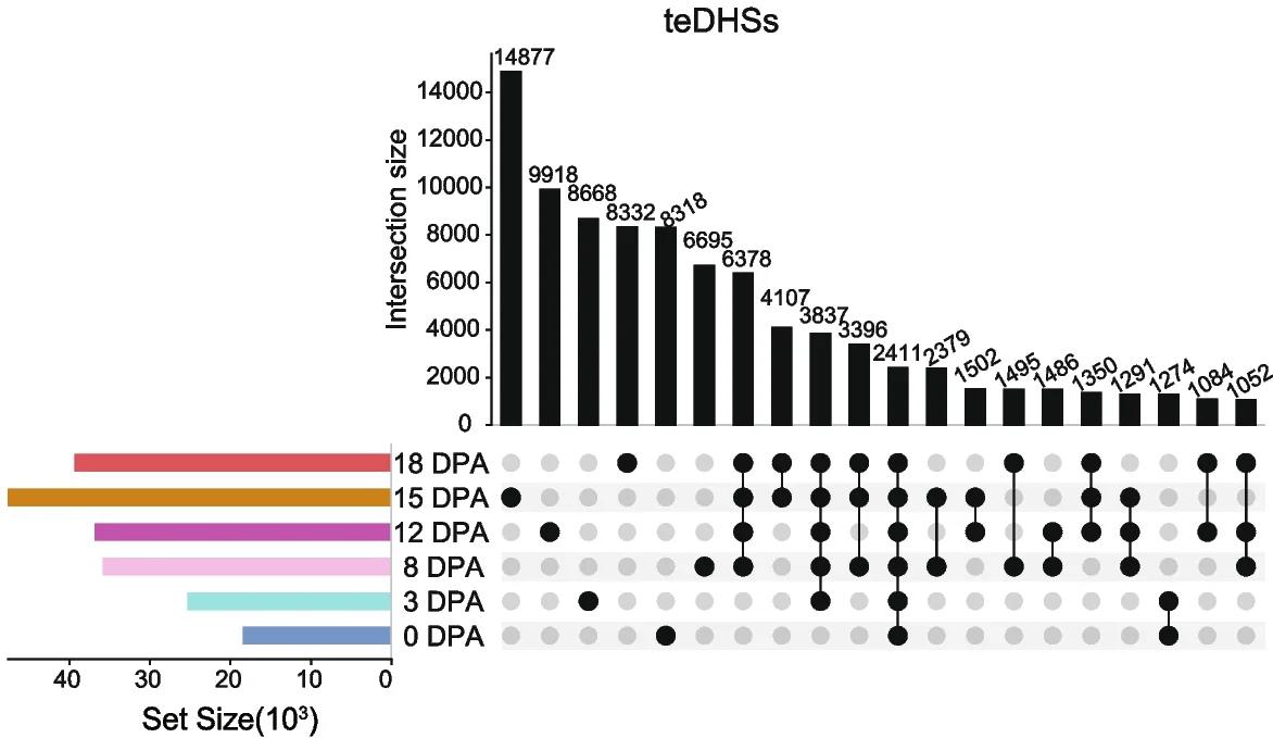
UpSet Plot
UpSet Plots revolutionize set intersection visualization, surpassing traditional Venn diagrams for complex multi-set comparisons in bioinformatics. This collection showcases advanced UpSet plot examples from genomics, proteomics, and systems biology publications. Essential for researchers analyzing gene set overlaps, pathway enrichment results, or multi-omics data integration. Master techniques for creating scalable, interpretable set visualizations using R UpSetR, Python pyupset, and interactive UpSet implementations for publication-quality combinatorial analysis figures.
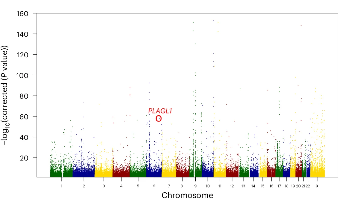
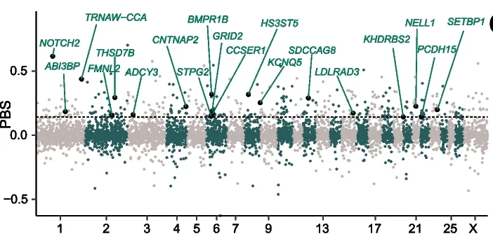
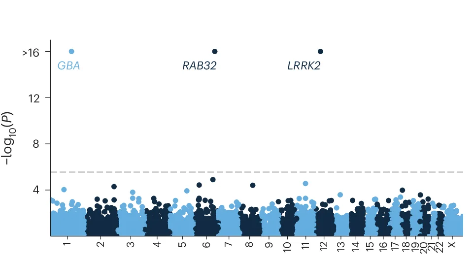
Manhattan Plot
Manhattan Plots are essential for genome-wide association study (GWAS) visualization, displaying genetic variant associations across chromosomes. This collection features exemplary Manhattan plot examples from human genetics, plant genomics, and precision medicine studies. Indispensable for researchers identifying disease-associated SNPs, QTLs, or selection signatures. Learn to create publication-quality Manhattan plots with proper significance thresholds, gene annotations, and zoom regions using R packages like qqman, CMplot, and specialized GWAS visualization tools.
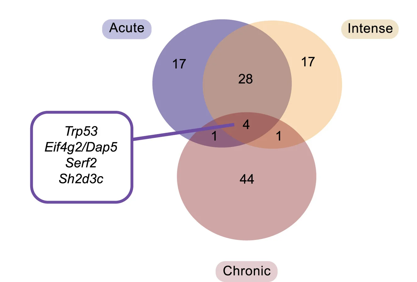
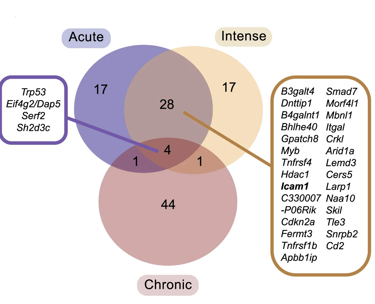
Venn Diagram
Venn Diagrams remain popular for visualizing set relationships and overlaps in biological and medical research. This collection features elegant Venn diagram examples from gene expression studies, taxonomic comparisons, and literature reviews. Perfect for researchers illustrating shared features, unique elements, or logical relationships between 2-5 sets. Explore modern approaches to creating proportional, aesthetically pleasing Venn diagrams using R VennDiagram, Python matplotlib-venn, and online tools for publication-ready set visualization.
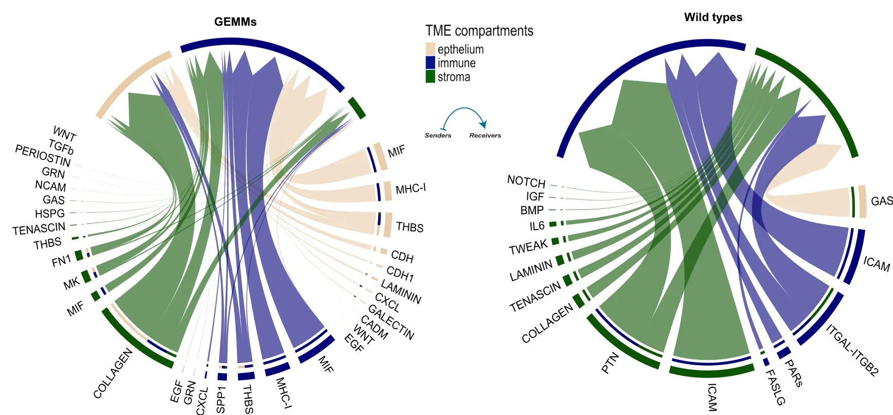
Chord Diagram
Chord Diagrams elegantly visualize complex relationships and flows between multiple entities in network biology and systems research. This collection features sophisticated chord diagram examples from genomics, ecology, and social network studies. Perfect for researchers illustrating gene co-expression networks, species interactions, or collaborative networks. Master circular visualization techniques for showing weighted connections, directional flows, and hierarchical relationships using R circlize, D3.js chord layouts, and specialized network visualization tools.
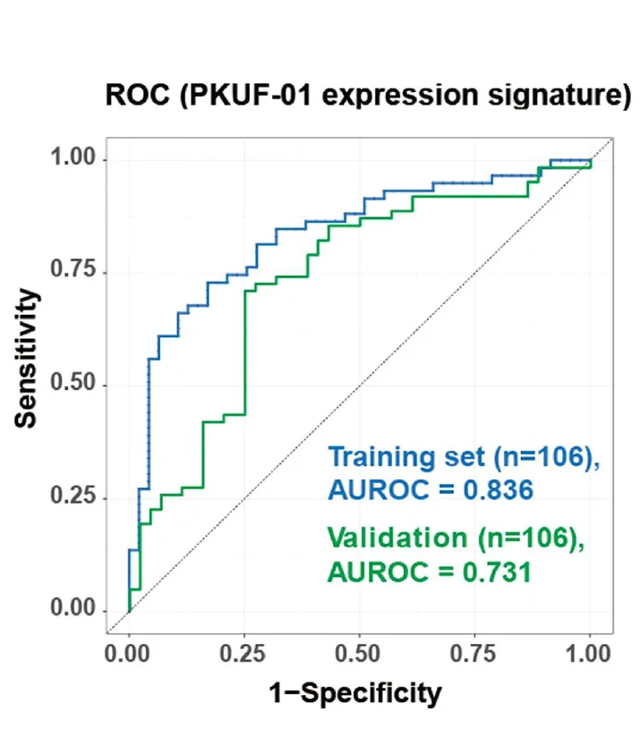
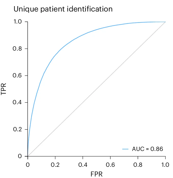
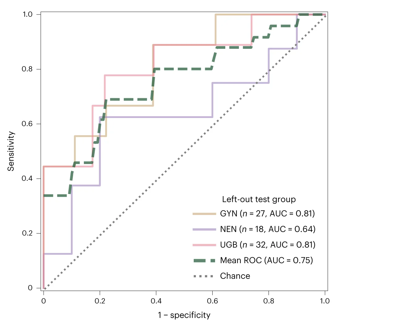
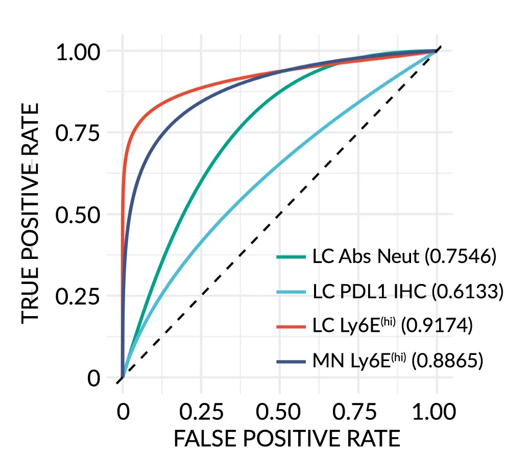
ROC Curve
ROC (Receiver Operating Characteristic) Curves are standard for evaluating diagnostic tests and binary classifiers in biomedical research. This collection features exemplary ROC curve examples from clinical diagnostics, biomarker validation, and machine learning applications. Essential for researchers developing diagnostic tools, evaluating screening tests, or comparing classifier performance. Learn to create publication-quality ROC curves with AUC calculations, confidence intervals, and optimal cutoff points using R pROC, Python scikit-learn, and specialized diagnostic accuracy tools.
00244-3/fig3_b.webp)
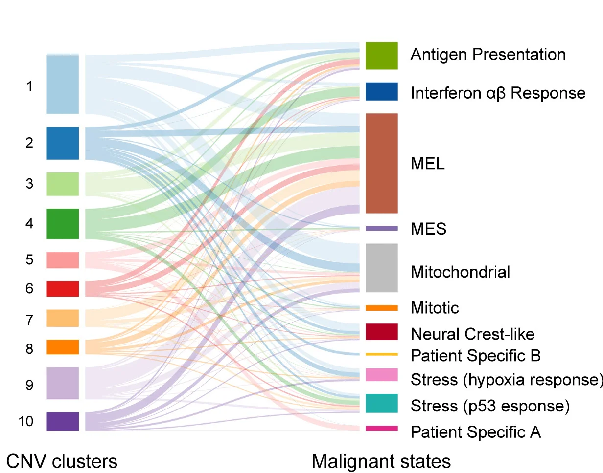
Sankey Diagram
Sankey Diagrams powerfully visualize flow quantities and transformations in energy systems, patient pathways, and material cycles. This collection showcases professional Sankey diagram examples from environmental science, healthcare analytics, and industrial ecology. Perfect for researchers illustrating energy flows, patient outcomes, or resource allocation in complex systems. Master techniques for creating informative Sankey diagrams with proper flow scaling, color coding, and interactive features using R networkD3, Python plotly, and specialized flow visualization tools.
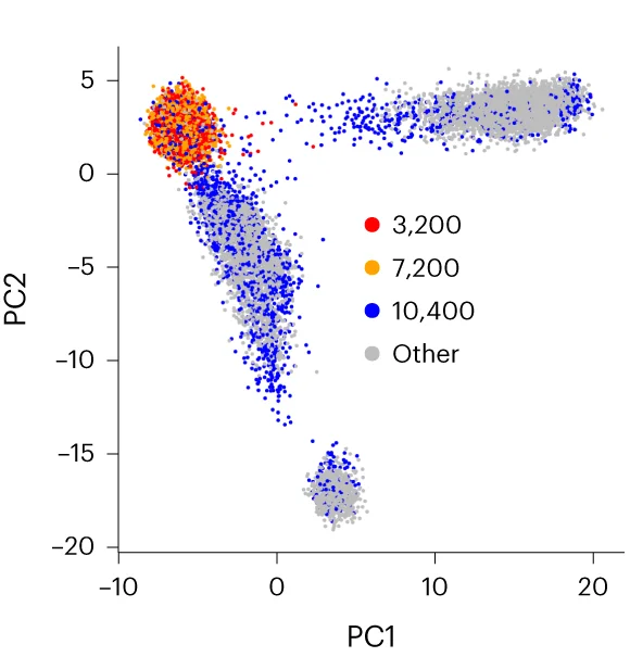
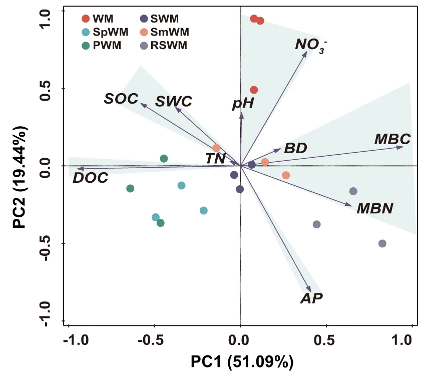
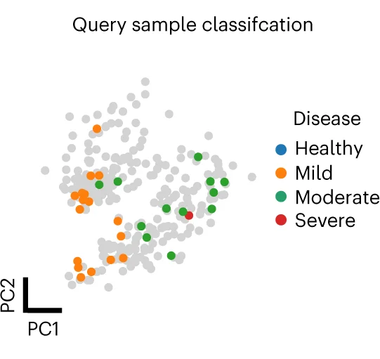
PCA Plot
A PCA (Principal Component Analysis) Plot is a fundamental visualization for exploring high-dimensional data. PCA is a dimensionality reduction technique that transforms complex datasets into a smaller number of "principal components," which capture the most variance in the data. The resulting 2D or 3D plot allows you to visualize the main patterns, clusters, and outliers in your data that would be hidden in a high-dimensional space. It is widely used in fields like bioinformatics, finance, and machine learning to simplify data, identify underlying structures, and prepare data for further modeling. Use a PCA plot to gain a clear, interpretable overview of complex data relationships.
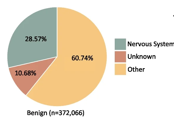
Pie Chart
Pie Charts effectively communicate proportional data when used appropriately in scientific contexts. This collection showcases well-designed pie chart examples from taxonomic composition, budget allocation, and survey results in research publications. Ideal for researchers presenting simple compositional data, funding distributions, or categorical proportions. Discover best practices for creating clear, accessible pie charts with proper labeling, color choices, and 3D effects using standard plotting libraries and data visualization tools.
Donut Chart
Donut Charts offer modern alternatives to pie charts for displaying proportional data with additional design flexibility. This collection presents well-designed donut chart examples from research funding visualization, sample composition, and survey results. Ideal for researchers creating infographics, dashboard displays, or presenting simple proportional data with aesthetic appeal. Explore techniques for creating effective donut charts with central annotations, nested rings, and interactive features using D3.js, Chart.js, and modern data visualization libraries.
Conclusion Diagram
Conclusion Diagrams synthesize research findings into powerful visual summaries, perfect for scientific papers, conference presentations, and grant applications. This collection features exemplary conclusion figures that effectively communicate key takeaways, research implications, and future directions. Essential for researchers crafting graphical abstracts, summary figures, and visual conclusions that enhance manuscript impact. Discover best practices for integrating multiple data types, highlighting significant findings, and creating memorable visual narratives using professional design tools and scientific visualization software.
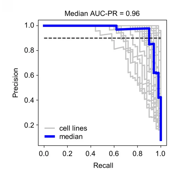
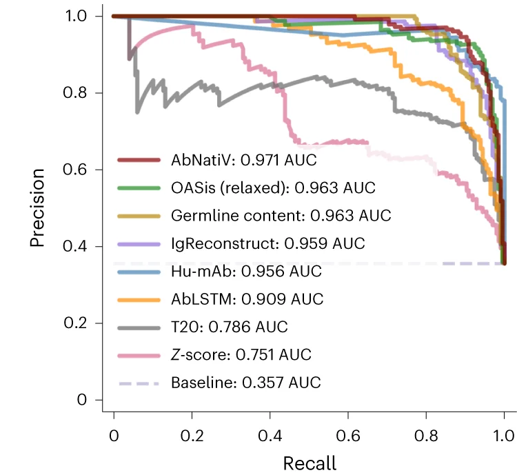
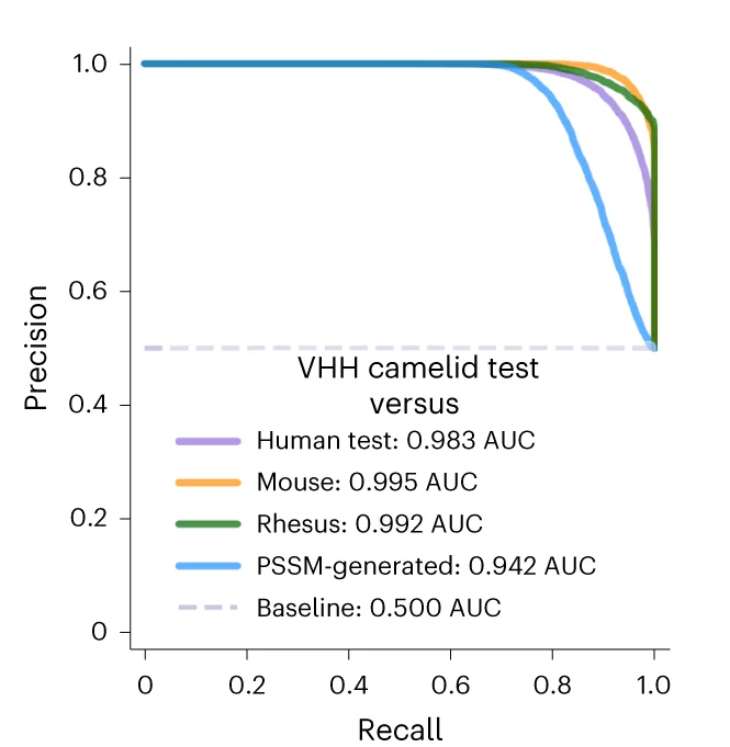
PR Curve
Precision-Recall (PR) Curves are essential for evaluating machine learning classifiers on imbalanced datasets in bioinformatics and medical AI. This collection features PR curve examples from diagnostic test evaluation, biomarker discovery, and predictive modeling studies. Critical for researchers developing clinical decision support systems or genomic classifiers. Learn to create informative PR curves showing AUC-PR, operating points, and confidence bands using scikit-learn, ROCR, and specialized ML evaluation tools for reproducible model assessment.
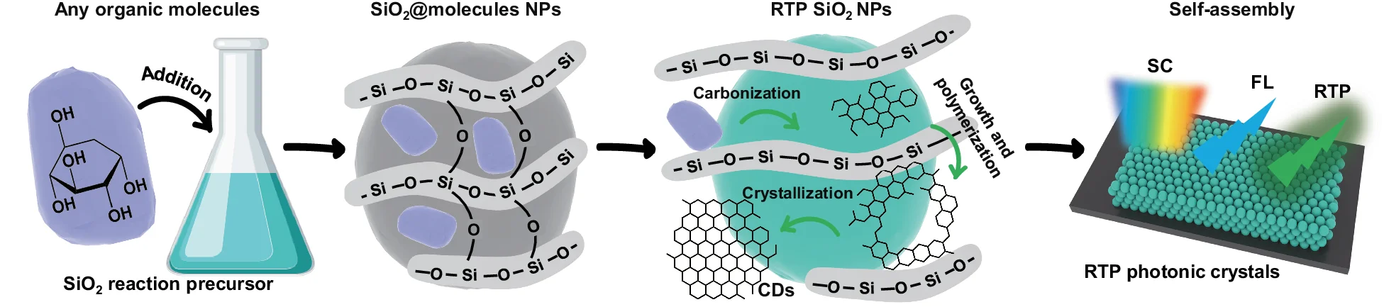
Illustration
An Illustration is a custom-designed visual used to explain a specific concept, process, or idea with clarity and impact. Unlike standardized charts, an illustration is tailored to the exact narrative you want to convey, using diagrams, icons, and graphics to make complex information intuitive and memorable. This is invaluable in scientific publications for explaining experimental setups, in educational materials for clarifying difficult topics, or in business for presenting strategic plans. A well-crafted illustration transcends data to tell a story, making it a powerful communication tool for engaging any audience and ensuring your core message is understood.
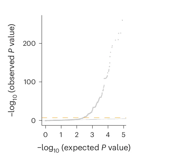
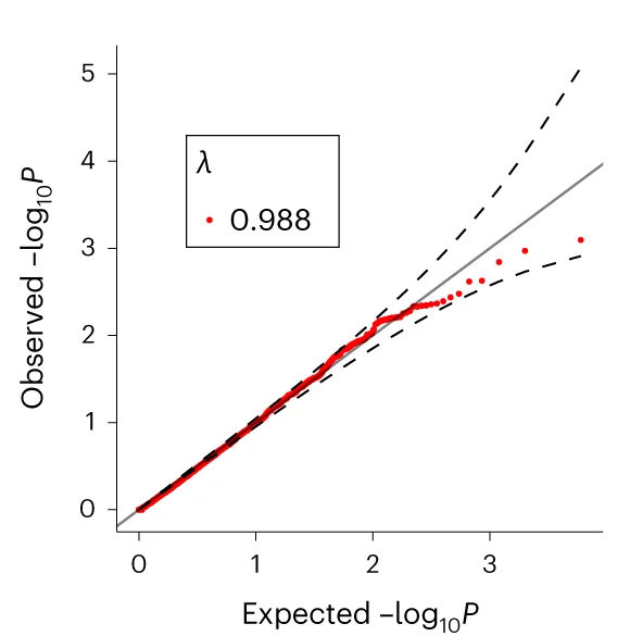
QQ Plot
A QQ Plot (Quantile-Quantile Plot) is an essential statistical visualization tool for assessing data normality and comparing probability distributions in scientific research. This collection showcases high-quality QQ plot examples from peer-reviewed publications, perfect for researchers conducting statistical analysis, hypothesis testing, and data quality assessment. Whether you're performing regression diagnostics, analyzing residuals, or validating statistical assumptions, these curated QQ plots demonstrate best practices for creating publication-ready figures. Explore examples using R ggplot2, Python matplotlib, and other scientific visualization tools to enhance your statistical data analysis workflow.
Line Plot with Scatter
Line Plots with Scatter Points combine trend visualization with raw data transparency, ideal for time-series analysis and model validation. This collection presents exemplary hybrid plots from longitudinal studies, growth curves, and kinetic analyses. Essential for researchers showing fitted models alongside experimental data, confidence intervals, or individual observations. Learn techniques for balancing line clarity with data point visibility using ggplot2, matplotlib, and specialized plotting libraries for creating informative scientific figures.